LOGOMAN BLOG #1 - ROCKETS BLASTOFF! AN OUT OF THIS WORLD IDENTITY.
In the summer of 1995, the Houston Rockets introduced one of the most revolutionary and controversial team identities in the history of sports branding. The Rockets launch came right after Houston had won back-to-back NBA Championships. From the start, the identity was filled with fan backlash. After all, how often does a team change their look after winning consecutive championship? 25 years have passed since the change, and today the navy blue, red and crystal blue Rockets designs are one of the top selling uniforms in the vintage throwback category.
On the 25th anniversary of the Houston Rockets identity relaunch, Gameplan Creative founder Tom O’Grady, the NBA’s first global creative director, and lead designer for the controversial Rockets branding and Gameplan Creative senior designer, Brigitte Smith, have rebranded the 1995 Rockets look using lessons learned in uniform design a quarter century later.
THE BIG E. + RUDY T.
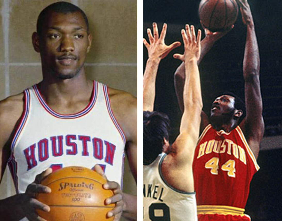
The original 1971-72 Houston Rockets uniforms looked a lot like the late ‘60’s University of Houston that future Rocket Elvin Hayes wore with its classic Medalist Sand-Knit piping and arched HOUSTON arched drop shadowed lettering and player numbers.
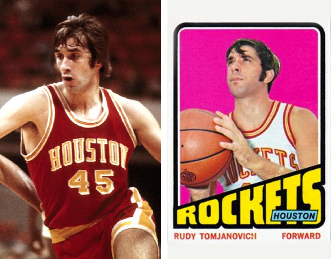
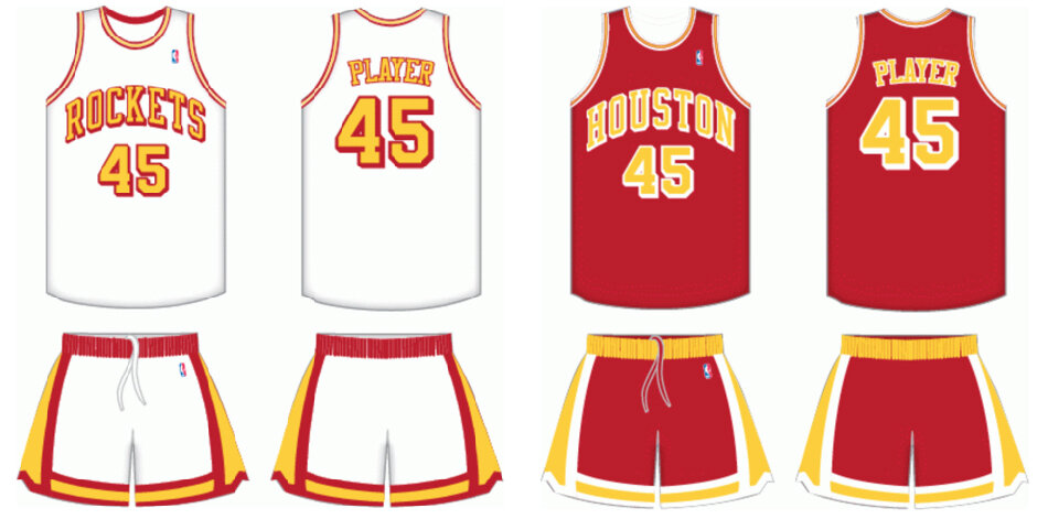
Over years, the Rockets colors became associated with fast food giant McDonald’s and Wendy’s crew outfits with their “ketchup red” and “mustard yellow” bright gaudy primary colors.
HAKEEM. BACK-TO-BACK TITLES. KC CHIEFS OF NBA BASKETBALL.

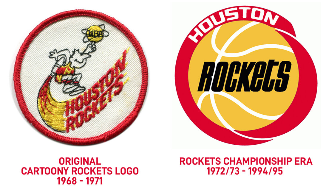
When the Rockets moved to Houston from San Diego in 1971, they featured a whimsical cartoony character logo and adopted it for one season as their official primary mark. A year later, the Rockets created a generic, abstract circle using the familiar McDonald’s red and golden arches yellow. The team updated their uniforms to an unremarkable white and red set with slanted ROCKETS and HOUSTON wordmarks. The design is void of a rocket, Houston iconography or the omnipresent lone star flag star motif, so familiar with other Texas sports teams.


Fans of the team initially compared the early ‘70’s Rockets new identity to the look of the NFL Kansas City Chiefs football team who featured the exact same ketchup red and mustard yellow color motif of the fast food giants.

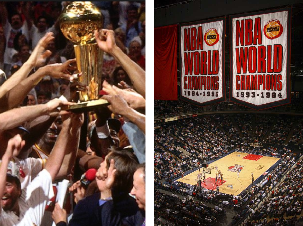
In the summer of 1993, the National Basketball Association and sports world was shocked when global sports icon Michael Jordan announced his early retirement from basketball so he could pursue his dream to play professional baseball. The announcement created an opportunity for NBA teams who had not been able to defeat the Chicago Bulls who had just finished a three-peat Championship run over the Lakers, Blazers and Suns. The team who seized the opportunity to secure the NBA crown in Michael’s absence were the Houston Rockets who went to win back-to-back NBA Championships in 1993-94 and 1994-95.
ROCKET MEN.
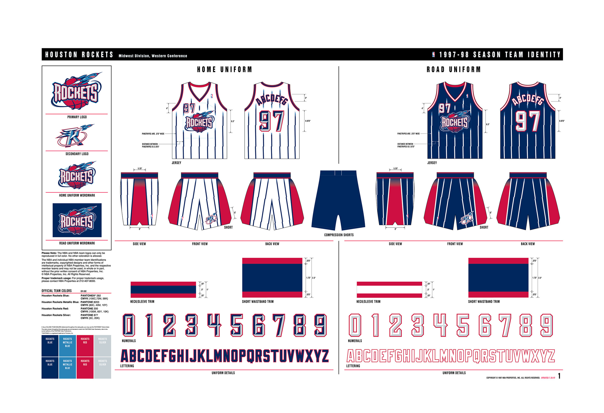
At NBA League Meetings in the summer of 1993, Rockets VP of Marketing, John Thomas applied for an official change to the Rockets brand identity (which they had worn for 21 seasons). Houston’s creative direction to NBA Creative Director Tom O’Grady was provide the Rockets a revolutionary design to include a rocket ship, deeper colors and consider an animated thematic to the overall look to match NBA team makeovers such as Suns, Hawks, Raptors and Grizzlies.


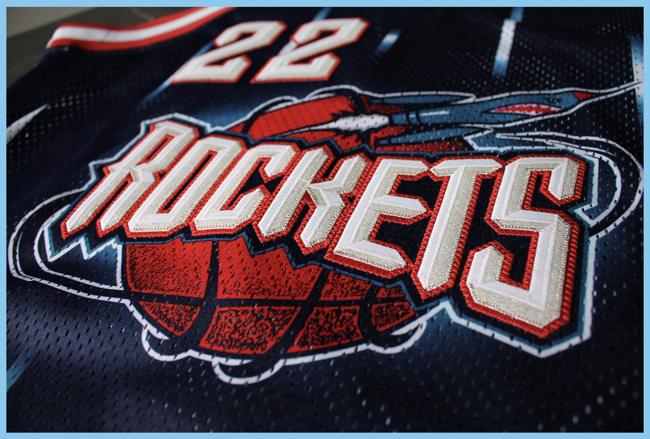
The design solution Tom O’Grady and NBA Creative Services developed was creating a very animated, whimsical beveled ROCKETS font wordmark in front of the special basketball and a snarling rocket ship orbiting around the basketball. The uniform designed was bold, memorable and energetic with sublimated imagery throughout jersey top and shorts including high quality metallic brushed tackle twill on the logo crest and player numbers.

When the Houston Rockets launched the identity, there was a blowback from team fans who wondered why a team would change their identity after winning back-to-back NBA titles? The answer? The process to design team logos, uniforms, courts then source the team authentic and replica jerseys to be produced overseas is an 18-month process. So the request to rebrand Houston happened in 1993, even before the won their first trophy. After the Rockets won their second NBA Championship, Rockets team owner Les Alexander requested the NBA postpone launching the new identity in the fall of 1995. Unfortunately, this was not possible as over $400k of official Rockets merchandise, legal fees and venue transformation costs had been spent and the League was not willing to absorb the team’s expenses.

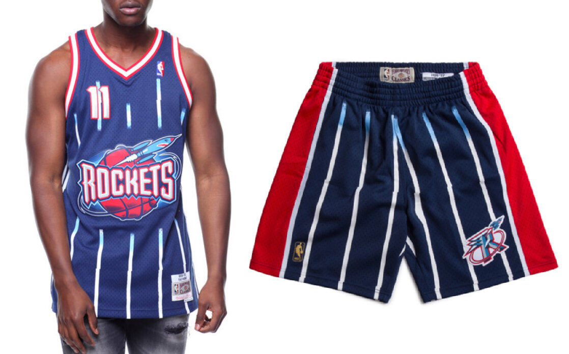

Today, the Houston Rockets 1990’s era rebrand is one of the top selling vintage throwback designs for Mitchell & Ness Nostalgia Company. The deep space navy blue, rocket red and quasar crystal metallic blue have been adopted as the quintessential 1990’s throwback look.
The NBA 1990’s are commonly referred to as “the Golden Era” with the brash “in your face” team identity solutions created by Gameplan Creative Founder Tom O’Grady is one of the visual reasons to help support that claim.
THE REVOLUTIONARY REBRAND.
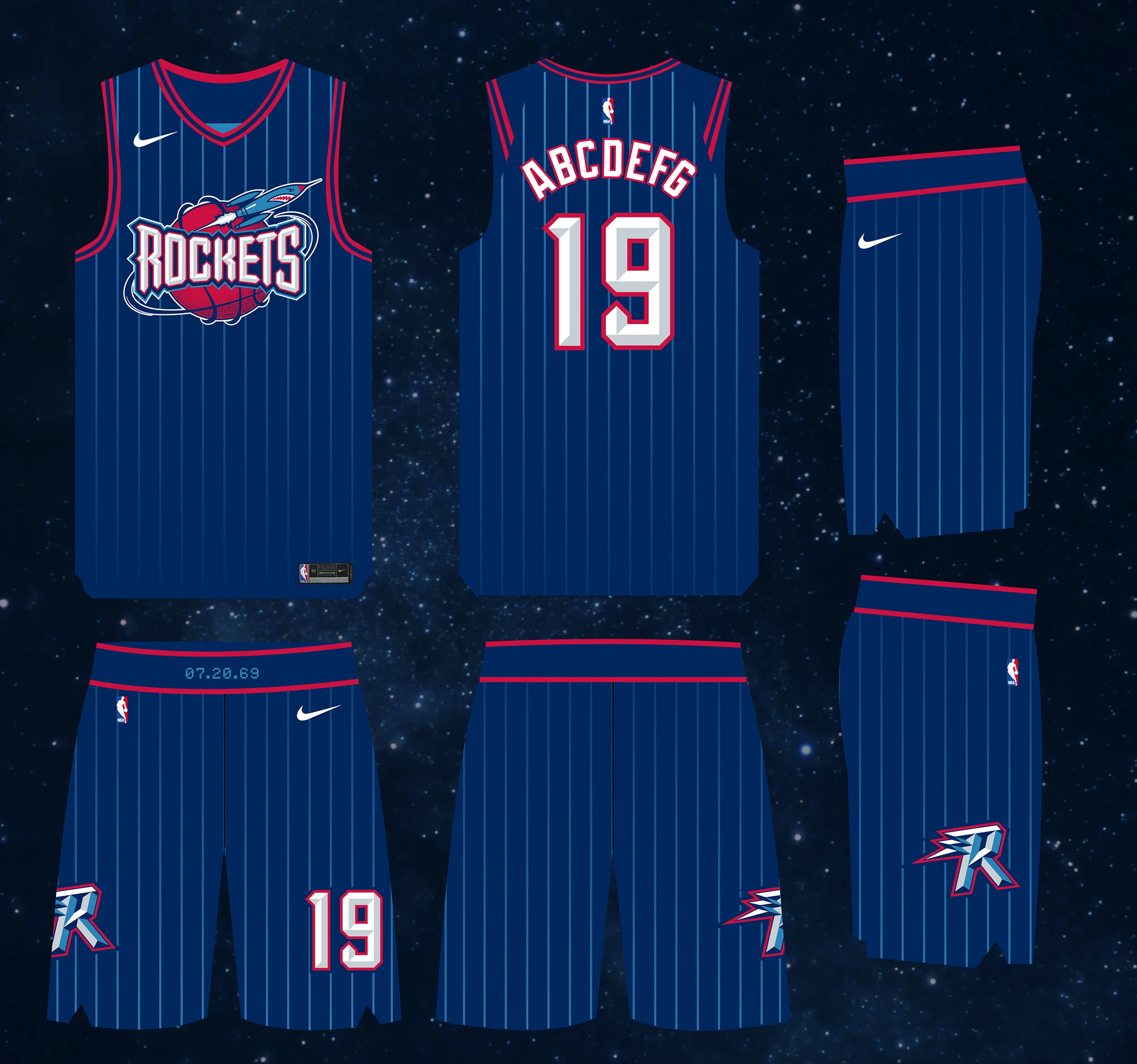
Houston We Have… A Relaunch! To commemorate the 25th Anniversary of the Houston Rockets 1995-96 rebrand, Gameplan Creative designers decided this would be an appropriate time to take a fresh look at the Rockets identity and update the branding with refreshed look and visual approach.
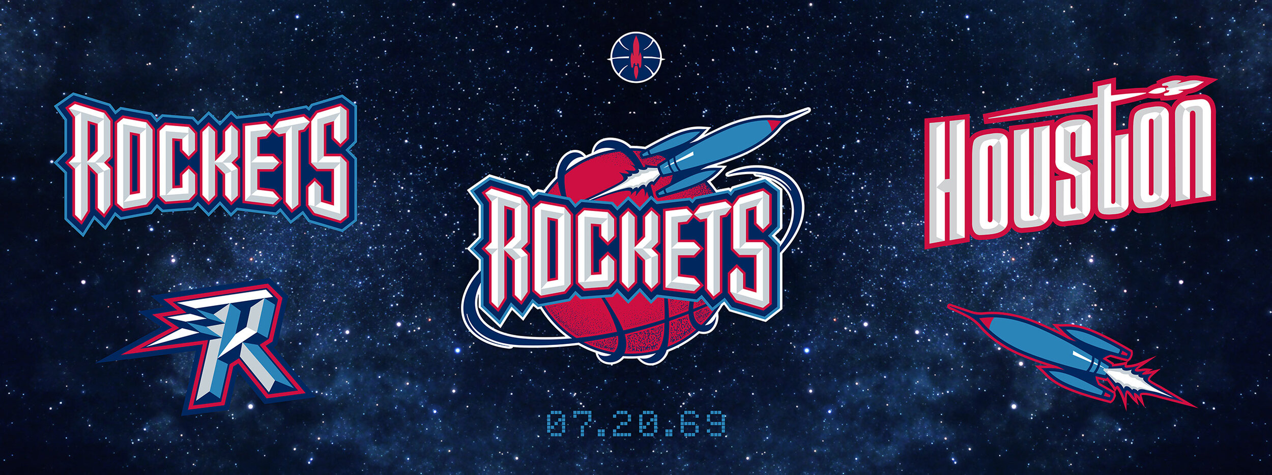
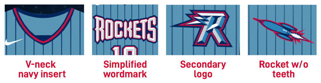
Refresh One: Gameplan Creative updated past team identities primary, secondary, terciary as well as the Houston and Rockets wordmarks. The teeth on the rocket in the primary logo and the orbiting rocket around the R secondary were removed. to reduce the cartoony nature of the identity.
Refresh Two: Gameplan Creative merged the 1973-1994 Houston-era wordmark by adding a streaking rocket to cross the T and bring that static HOUSTON design to life.
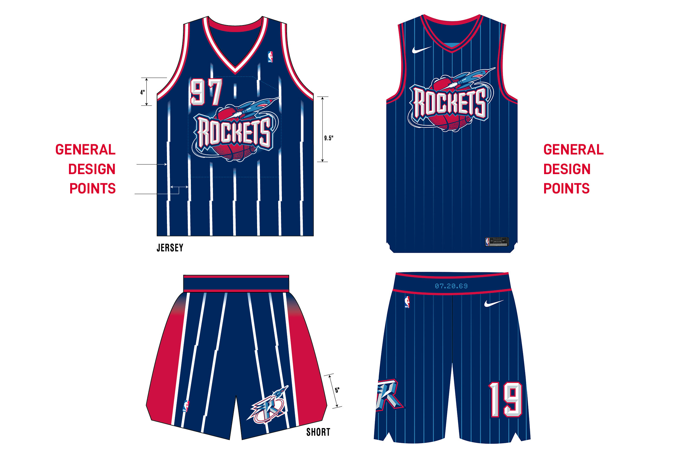
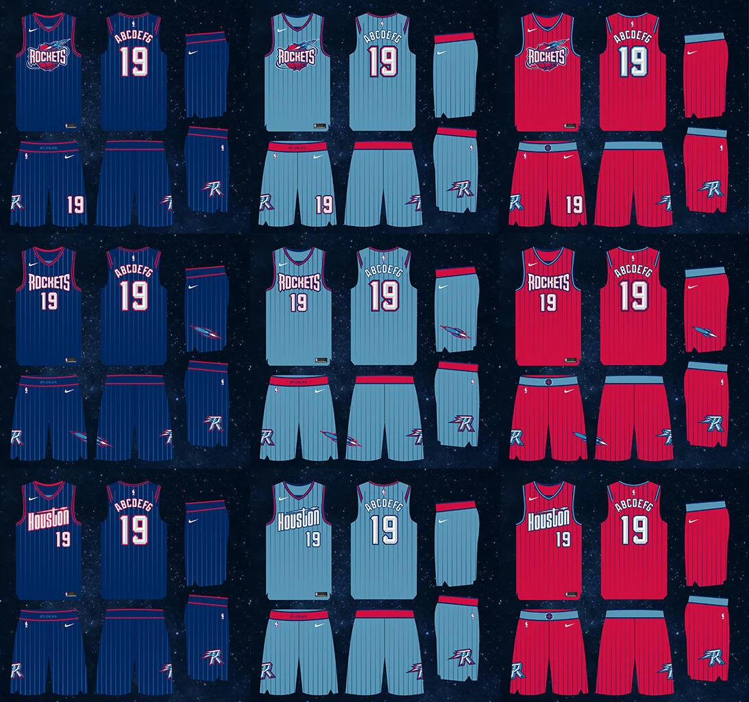
Refresh Three. Gameplan Creative designed a set of uniform options in navy blue, red and crystal blue featuring three separate wordmarks while simplifying the bold white pinstripes so strikingly familiar on the previous 1995-96 Rockets uniforms.
GAMEPLAN CREATIVE FOCUSED ON NEW BREATHABALE FABRIC, A TIGHTER FIT AND A CLEANER LOOK TO EVOLVE THE ROCKETS UNIFORMS.