Jerry West Is Not Logoman Blog
The Authentic Voice of Sports Design Branding.
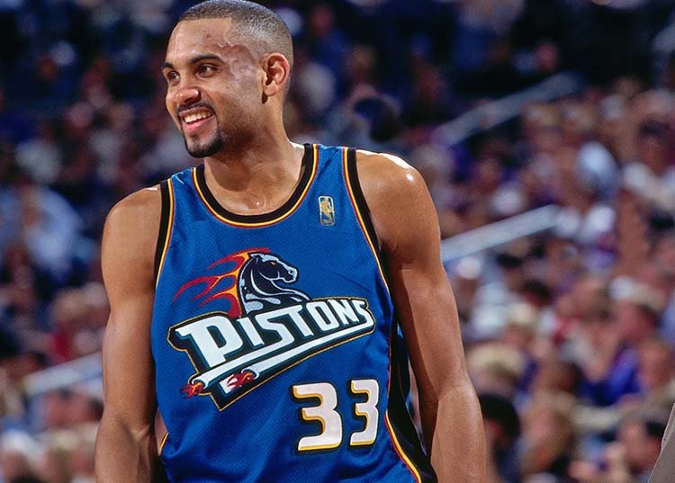
LOGOMAN BLOG #8 - THE REAL DEAL RE: PISTONS TEAL.
In 1995, at the apex of the revolutionary period in NBA uniform design, the Detroit Pistons wanted to be part of the movement. Detroit Pistons President Tom Wilson reached out to NBA Vice President and Creative Director Tom O’Grady to begin the process of rebranding one of the League’s oldest franchises who first played their games in Fort Wayne, Indiana as the O’Grady immediately began the process address updating the logo with a fresh look.
LOGOMAN BLOG #7 - NUGGETS OF WISDOM. COMMISSIONER STERN AS IN LEARN.
Thomas O’Grady, the NBA’s first-ever Creative Services Director, remembers getting a mysterious beckoning to NBA Commissioner David Stern’s office. When he walked into the New York office in 2001, after having worked with Stern for more than a decade of the eventual 13 years he would be at the NBA under Stern, O’Grady saw final Denver Nuggets-approved logo designs laying on Stern’s desk. O’Grady didn’t know what the problem was.
LOGOMAN BLOG #6 - WINGS UP! WHEN YOU’RE A JET… YOU’RE A JET.
A Simple (Game)Plan: Re-Reimagining The NY Jets
In 1969, the green and white clad New York Jets changed the NFL forever. The upstart AFL had lost the first two Super Bowls to the establishment NFL with Vince Lombardi leading the Green Bay Packers by lopsided scores of 35 to 10 over the Chiefs and 33 to 14 over the Oakland Raiders….
LOGOMAN BLOG #5 - ALL CHARGED UP! A BOLT APPROACH IN LA.
When the LA Chargers launched their new uniforms for the 2020 Season; Gameplan Creative took a creative spin and made the look their own.
LOGOMAN BLOG #4 - NBA ALL-STAR CLASSICS. A FULL COURT BRAND SOLUTION.
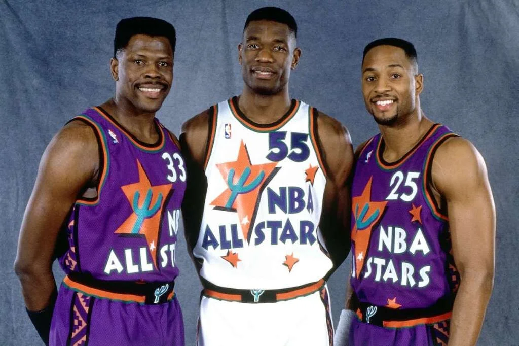
Beginning with the 1992 NBA All-Star Game in Orlando, our creative team incorporated the Magic’s royal blue, black, silver colors (along with red and blue) for the event identity. This paradigm shift radically changed how the League now brands its’ NBA All-Star games and other NBA International events so commonplace today…
LOGOMAN BLOG #3 - NOTHING BUT NETS! IT CAME FROM THE SWAMP.
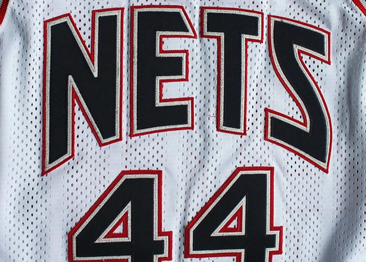
N.J. Americans. New York Nets. New Jersey Nets Basketball. New Jersey Nets. Nets.New Jersey Swamp Dragons (stay tuned). Brooklyn Nets. First, an ABA franchise. Then absorbed into the NBA. The team most commonly known has the NETS has been on quite the brand identity roller-coaster ride. In pro basketball, there has been no team with a more nomadic existence, moving to Long Island in 1968 and playing in various arenas there as the New York Nets and that included a series of name, logo and uniform variations within the same local market (NY/NJ). Today they are the BROOKLYN Nets and have finally found a permanent home at Barclays Center in the borough (on Long Island)…
LOGOMAN BLOG #2 - THE SUN NEVER SET! A MODERN CLASSIC IN PHX.
25 years ago, National Basketball Association VP/Creative Director (and Gameplan Creative Founding Partner) Tom O’Grady headed out west from his office overlooking 5th Ave. for a fortuitous meeting with the NBA Phoenix Suns front office ownership team. The reason for the meeting: discuss the possibility of an entire rebrand and creative direction for the Suns brand identity which would be tied to their move into the new America West Airlines Arena in downtown Phoenix to begin play in the fall of 1992…
LOGOMAN BLOG #1 - ROCKETS BLASTOFF! AN OUT OF THIS WORLD IDENTITY.
In the summer of 1995, the Houston Rockets introduced one of the most revolutionary and controversial team identities in the history of sports branding. The Rockets launch came right after Houston had won back-to-back NBA Championships. From the start, the identity was filled with fan backlash. After all, how often does a team change their look after winning consecutive championship? 25 years have passed since the change, and today the navy blue, red and crystal blue Rockets designs are one of the top selling uniforms in the vintage throwback category…


