LOGOMAN BLOG #4 - NBA ALL-STAR CLASSICS. A FULL COURT BRAND SOLUTION.
I joined the NBA in June of 1990 as the League’s first official creative director with the mission of building a Creative Services group to rival growing NFL, MLB and NHL in-house divisions.
My boss, Rick Welts, who was head of NBA Properties at the time challenged me with looking at everything the League was doing with their brand identity and graphic design efforts. My initial focus was analyzing how the NBA was visually presenting their special events, especially NBA All-Star Games. The 1991 Charlotte NBA All-Star Game look had just been introduced just before I started and the ASG court and team uniforms for the game were in production so I could not directly affect the look and feel of the event that February.
We were able to use Charlotte Hornets teal and purple in the cover of the official NBA All-Star Game program cover but that was the only element using the team’s primary colors.
One of the things that struck me about many of our previous NBA All-Star Games was the very dominant use of NBA red and blue for all All-Star game uniforms, courts, logos and collateral materials.
After the Charlotte All-Star Game ended, we reconvened with NBA Special Events, NBA Licensing and with Commissioner Stern who agreed with our recommendation to move away from standard NBA red and blue and move to use a team’s primary colors which would bring a more local marketplace flavor to all events and adding fan appeal for event merchandise.
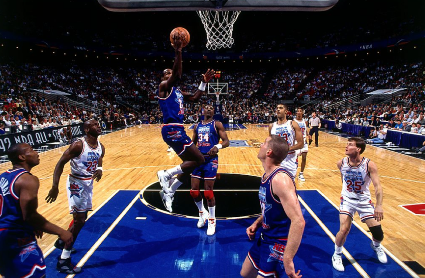
Beginning with the 1992 NBA All-Star Game in Orlando, our creative team incorporated the Magic’s royal blue, black, silver colors (along with red and blue) for the event identity. This paradigm shift radically changed how the League now brands its’ NBA All-Star games and other NBA International events so commonplace today.
The 1992 Orlando All-Star Game event look and feel using the Magic’s team colors was a big success from a visual standpoint. Today, every NBA All-Star Game features the hosting team’s colors merged with indigenous symbolism and historic relevancy when appropriate. Our NBA creative team used the same event branding formula for both 1993 and 1994 All-Star Games with similar success.
For the 1995 NBA All-Star Game in Phoenix, we challenged ourselves to visually surpass what we had done for the past four All-Star Games and Phoenix would prove to be an excellent venue to push the envelope. Our success designing the wildly popular Phoenix shooting Suns logo and uniforms back in 1992 allowed our creative team full reign setting a new visual bar on pro basketball event branding.
For the 1995 NBA All-Star Game, our creative team oversaw the design of:
• All-Star Game logo/secondary marks
• All-Star Game jerseys
• All-Star Game court
• All-Star Game courtside signage
• All-Star Game collateral
• Schick All-Star Rookie Game uniforms
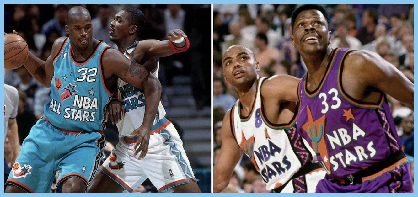
Our design approach was to “peel apart” the 1995 ASG primary logo and apply each graphic across every brand element for the All-Star Game. We repurposed the leaning cactus, the whimsical star, the Aztec-style pattern, the setting sun basketball graphic and popular gecko secondary logo (which was featured prominently on the court) which all provided a highly cohesive look for the three-day event at America West Arena.
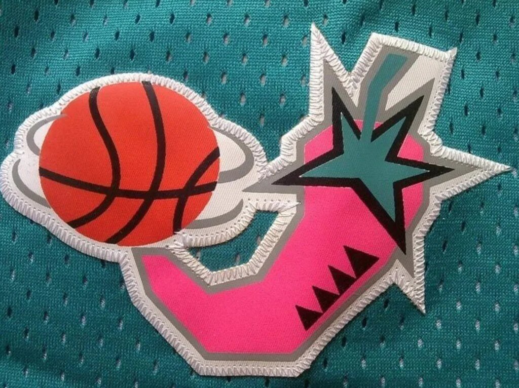
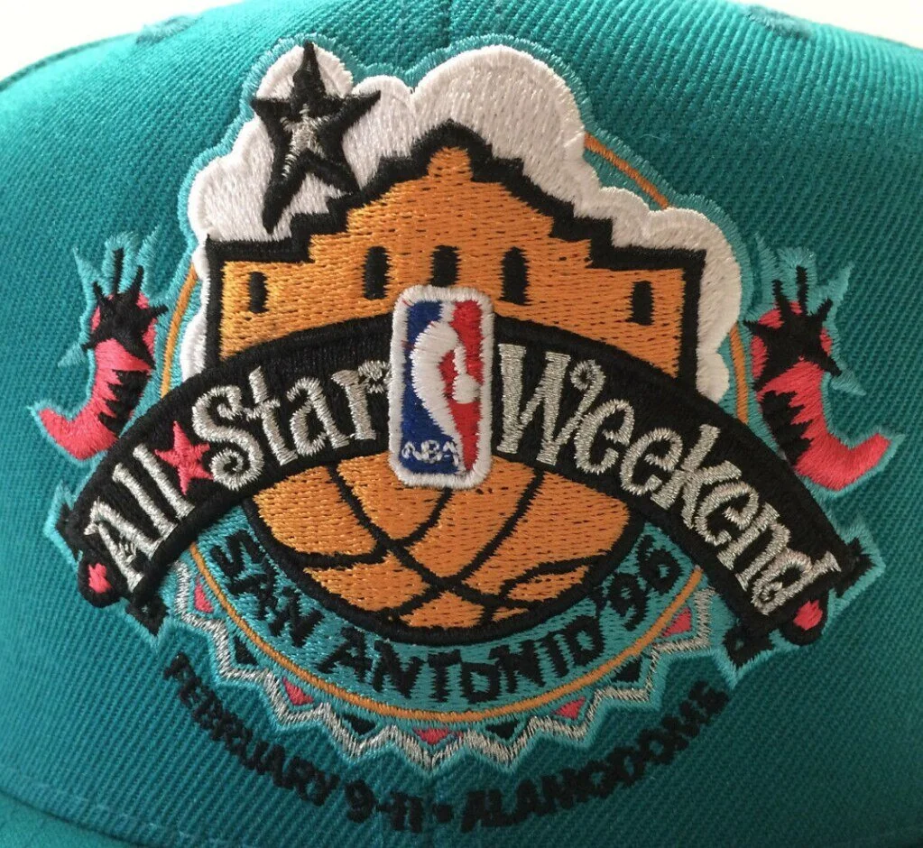
And the following year in San Antonio, we used a fiesta-style treatment.

