LOGOMAN BLOG #3 - NOTHING BUT NETS! IT CAME FROM THE SWAMP.
The New York Americans. New Jersey Americans. New York Nets. New Jersey Nets. New Jersey Nets Basketball. The Nets. New Jersey Swamp Dragons (stay tuned). And finally the Brooklyn Nets. The team most commonly known has the Nets has led the most nomadic relocation existence in the entire history of pro basketball in North America.
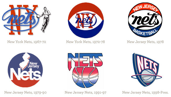
AMERICANS IN NEW JERSEY. NETS IN NEW YORK.
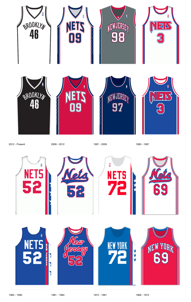
The New York Americans franchise was established in 1967 as a charter franchise of the NBA's rival league, the American Basketball Association (ABA). But after the team could not find a home to play in Manhattan/Queens they found their home at the Teaneck Armory in Teaneck, New Jersey where they played during their first season. They quickly changed their name to the New Jersey Americans, but struggled with attendance in Northern New Jersey. So after only one-year in New Jersey, the team moved to Long Island in 1968 and with the move came a new name, the New York Nets. They chose the name Nets since New York already had the Mets and the Jets, so it was only natural the city’s newest pro basketball franchise should be named the Nets.
1974 AND 1976 ABA CHAMPS. DR.J. AND NY NETS UNIFORMS.
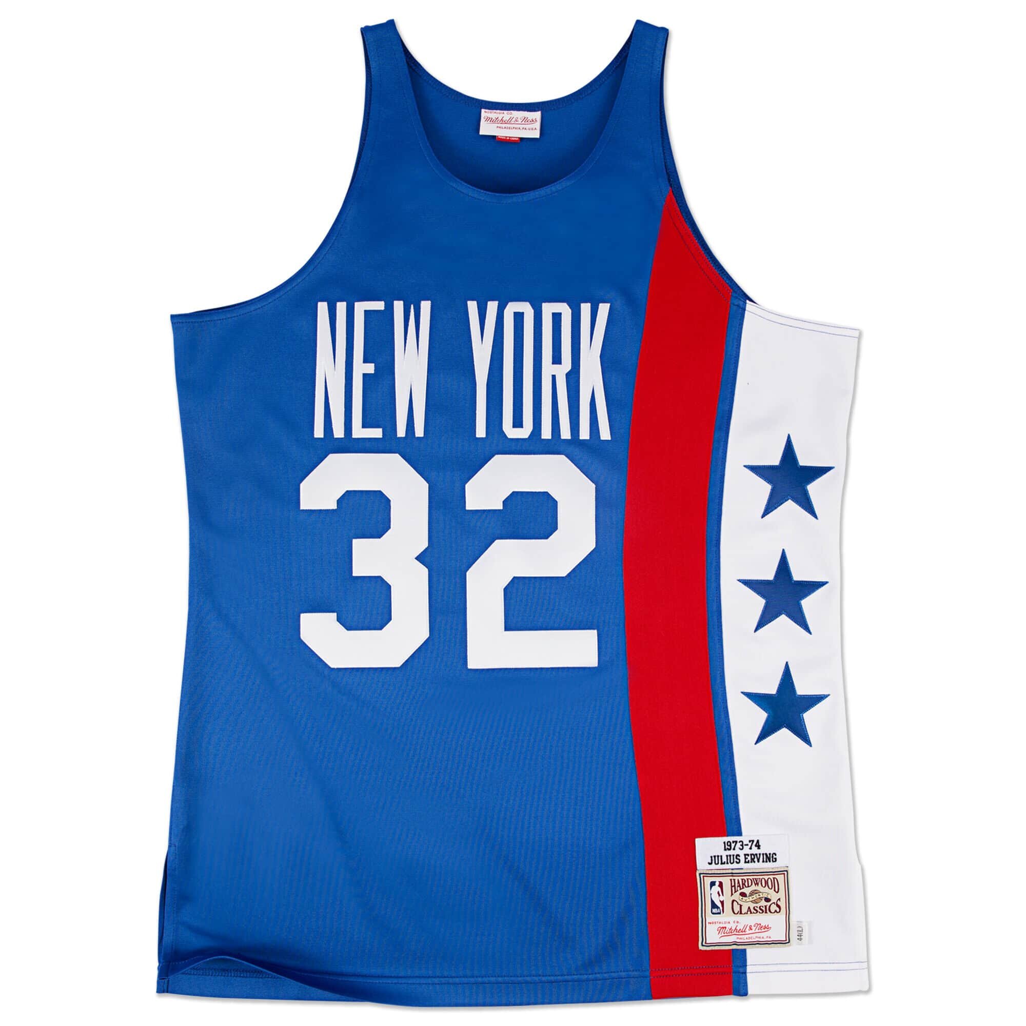
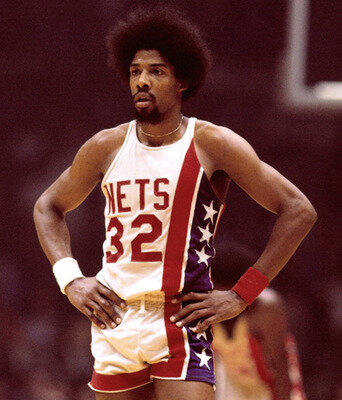
In 1973-74, the cash strapped ABA Virginia Squires sold the rights to one of the most legendary players in professional basketball history, Julius Erving, "Dr. J.” who immediately made an impact on a talented Nets team. The Nets would flourish with the addition of Dr. J and they went on to win ABA Championships in both 1974 and 1976. During those seasons, the Nets wore what would become one of the most popular throwback designs in pro basketball history, the #32 Erving New York Nets star-stripped design was arguably the Nets' aesthetic high-water mark with a clean, simple home white and away royal blue uniforms.
ABA FOLDS. NUGGETS, PACERS, SPURS AND NETS NOW NBA TEAMS.
After the 1976 season, the American Basketball Association ceased operations due to financial hardships. However, the four most successful ABA teams were absorbed into the National Basketball Association beginning in the 1977 season: the Denver Nuggets, the Indiana Pacers, the San Antonio Spurs and… the New York Nets. As part of the move to the NBA the Nets would be moving from Nassau Coliseum on Long Island to the Rutgers Athletic Center in Piscataway, New Jersey and change their name to the New Jersey Nets, a name they would keep for 37 seasons while playing at three different arenas. Again, the nomadic Nets pattern of moving names and venues would continue.
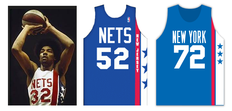
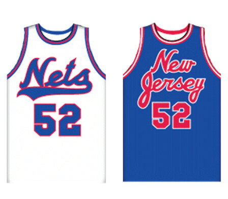
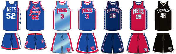
During their first 13 seasons in New Jersey, the Nets featured a uniform similar to the design they wore during their successful ABA New York seasons where they simply removed NEW YORK from the front and replaced with NEW JERSEY stacked vertically next to the familiar star side panel. For the home uniforms, the Nets kept the bold red, white and blue side panel, the same uniform design template worn during the"Dr. J" ABA-era.
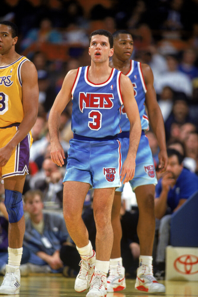
During 37 seasons in New Jersey, the Nets saw extended periods of mediocrity and occasional longer losing periods due to poor player drafts, ill-advised trades, and complicated decision-making confusion in the front office by “The Secaucus Seven, a group of owners who struggled to agree on simple decisions. This Nets dysfunctionality made it difficult for the team to have consistency in coaching, players and team marketing. However, during this period the Nets featured interesting uniform designs including a Nets and New Jersey baseball-inspired script, somewhat unusual for basketball teams. The overall look for the Nets from 1976 through 1990 was a classic NBA royal blue and red color scheme with bold numbers and simple trim.
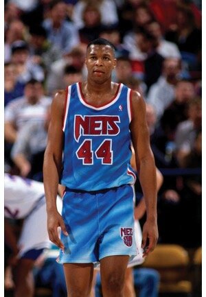
1990. NETS TIE-DYED ONE-YEAR WONDER UNIFORMS.
At the onset of the last decade of the millennium, rapidly advancing computer graphics technology (Adobe Photoshop and Illustrator) and dye sublimation uniform fabrication breakthroughs were changing the way NBA team uniforms would be designed and produced--- ushering in the most creative period to team sports uniform design history.
At the forefront of the revolutionary uniform designs… were the New Jersey Nets who typically were not associated with being cutting-edge anything. The Nets created what came to be known as the "tie-dyed Nets” because of the similar look to tie-dyed fashions made popular in late 1960’s and early 70’s on clothing and rock group concert t-shirts.
WHAT IS A NEW JERSEY SWAMP DRAGON?
In 1995, NBA creative director Tom O’Grady was approached by New Jersey Nets team president Jon Spoelstra about rebranding the New Jersey Nets. Jon was interested in a complete brand identity overhaul including a new team name (very unusual in team sports). Jon’s reasoning was simple: the Nets had not established an identity since the team had moved to the Garden State from Long Island in 1977. Jon felt the Nets would always be the second New York market basketball team to the tradition-rich New York Knicks. Woeful team attendance struggles bore out Jon’s claim as the Nets struggled at the ticket gate and with team merchandise sales.
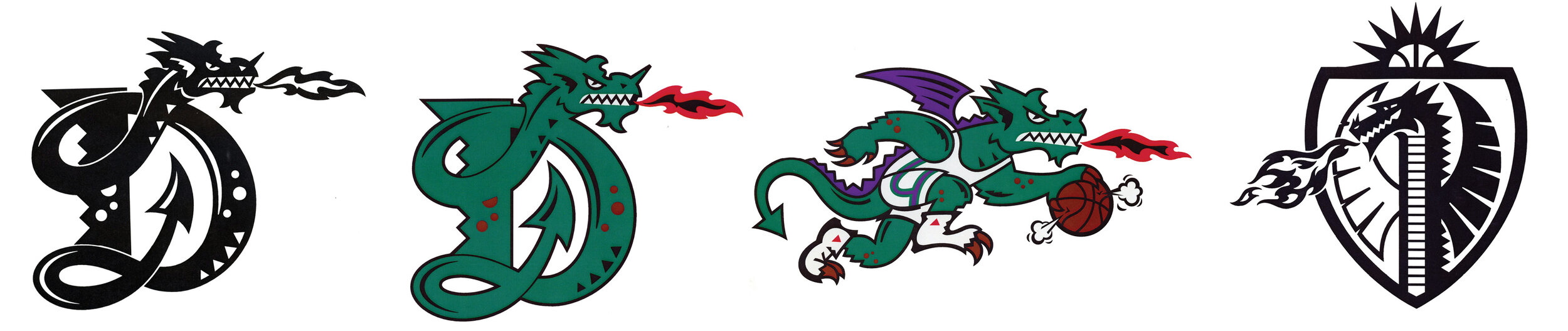
Jon wanted to make a "radical change” to the Nets identity and Spoelstra told NBA league executives he would not go through with a change unless the new brand direction was unique to team sports clubs and “jarring” in its look and feel. During the initial meeting with NBA Creative Services, O’Grady shared a series of team logo options being considered for the new expansion NBA Toronto franchise. Jon was immediately drawn to a series of animated dragon designs but the name “Dragons” was still in the running for the Toronto club. However, Toronto chose Raptors as their new nickname, and the New Jersey Nets got their wish for the Dragons name and work-in-progress logos.

While doing a trademark search for possible names for Toronto, NBA Legal discovered name protection issues for the name “Dragons”. Many professional, college, and minor league teams have/had the name Dragons, which made owning the name and the designs potentially difficult and could be very costly and time-consuming for the NBA and Nets.
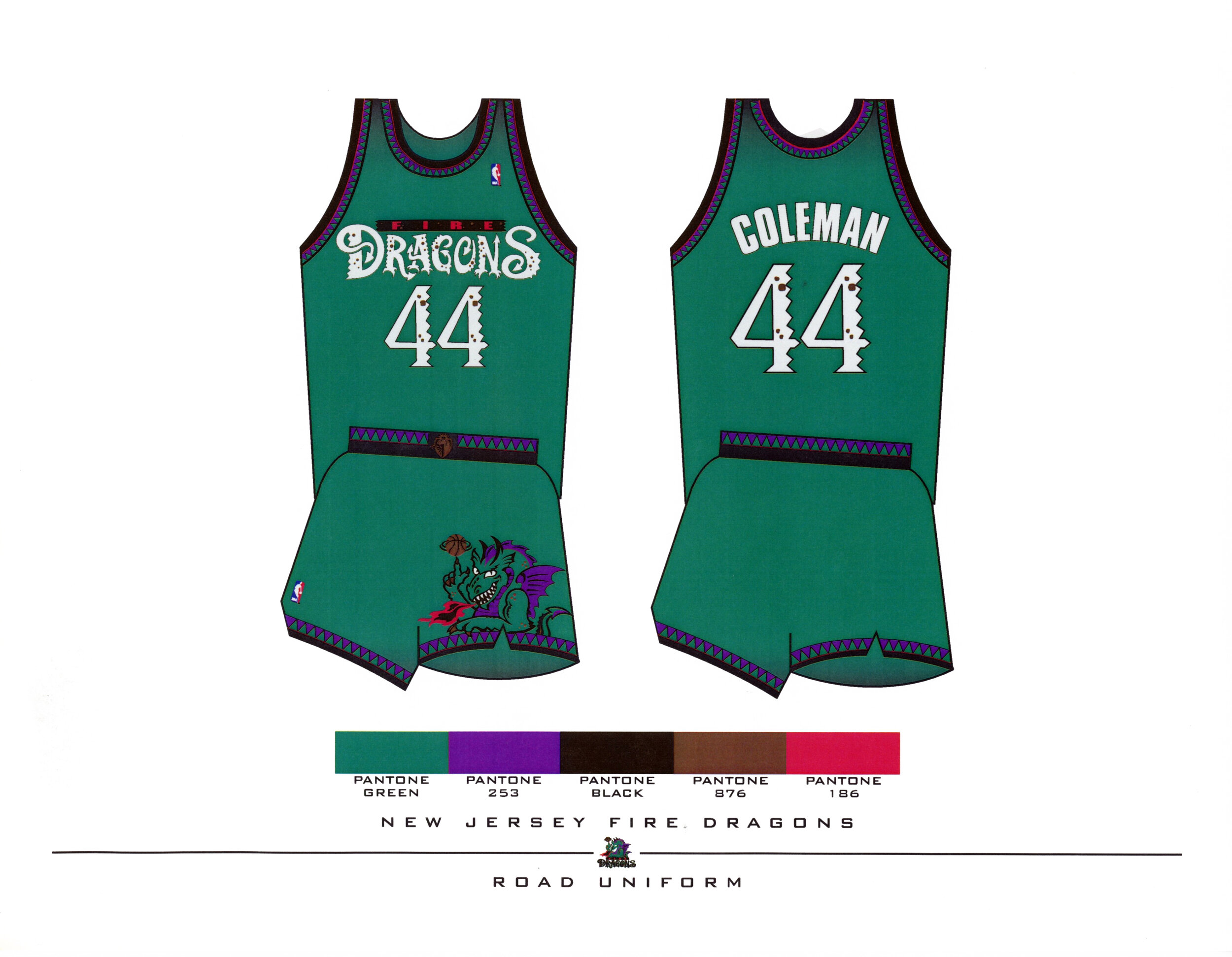
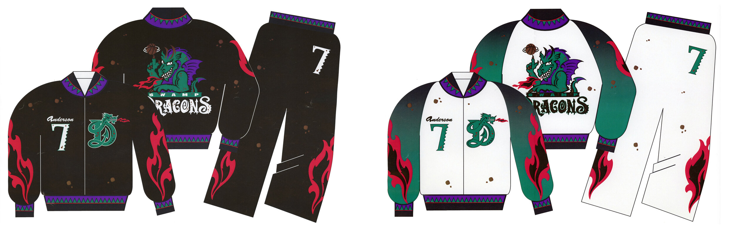
In 1995, the New Jersey Nets played at the Continental Airlines Arena in East Rutherford, NJ, with the stadium sitting in the middle of protected marshlands, often mockingly referred to as the "Swamps of New Jersey”. During a follow-up meeting with the Nets on the Dragons rebrand, Jon presented a simple 8 1/2” x 11” sheet of white paper with “NEW JERSEY SWAMP DRAGONS” in 72 pt. Helvetica and explained the Nets wanted to embrace their marshlands home to become the New Jersey SwampDragons.
The NBA felt the Swamp Dragons name was too outrageous and possibly offensive and thought it would take on negative connotations with fans of the Nets and the NBA. However, the Nets team’s executives pointed to the immediate success of the Toronto Raptors name, logo, and uniforms and felt the Swamp Dragons identity could provide the same results for the Nets franchise.
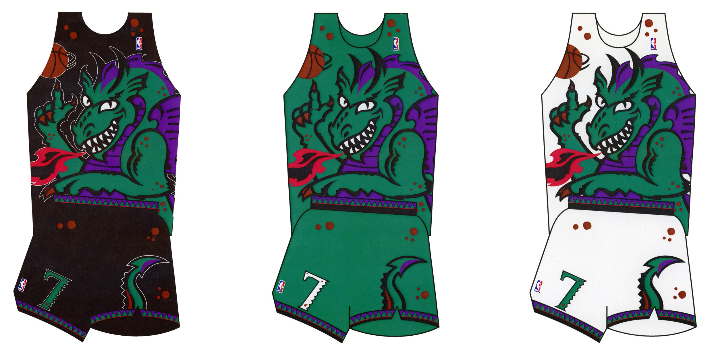
The NBA allowed the Nets to continue to work with O’Grady and his NBA Creative Services team to pull together a New Jersey Swamp Dragons rebrand to include new colors, logos, uniforms, warm-ups, and court designs. These graphics were prepared to present to the NBA Board of Governors for ratification and approval for the change. Some NBA owners felt the new Swamp Dragons looked too outlandish, but they felt it was the right of Nets team owners to make the final decision on the New Jersey Swamp Dragons. Ironically, the one vote that stopped the change from the name Nets to the SwampDragons was from one the seven dysfunctional owners of the New Jersey Nets. Having the nominating team casting a no vote… (fortunately or unfortunately?), the Swamp Dragons name and unique identity was slayed to rest. Back to the drawing board.
WHAT’S A NET?
Designing a logo for a team named “The Nets” was the challenge confronting O’Grady and his creative services staff. The Nets were originally named Nets since it rhymed with Mets and Jets, certainly not the most visually compelling reason to name a pro basketball team. It was assumed when fans say, “Nets”, they are referring to basketball netting.
At the onset of the new Nets logo design project, O’Grady challenged himself and his creative team to NOT use basketball netting for the first round of roughs and instead look to other options that might suggest net/nets and work on those ideas further. As O’Grady and his team explored more logo concepts, a direction commanding the most attention was a shield shape with an oval rim (without netting), a basketball, and bold NETS lettering. The original Nets shield logo designs were similar to European soccer clubs’ badges. Patch-like designs are simple to reproduce across the countless applications a pro team logos will be used. A significant advantage of the name Nets is how short the name is giving designers more freedom when crafting the icon. Additionally, the Nets stipulated not to incorporate the name New Jersey into the primary logo design.
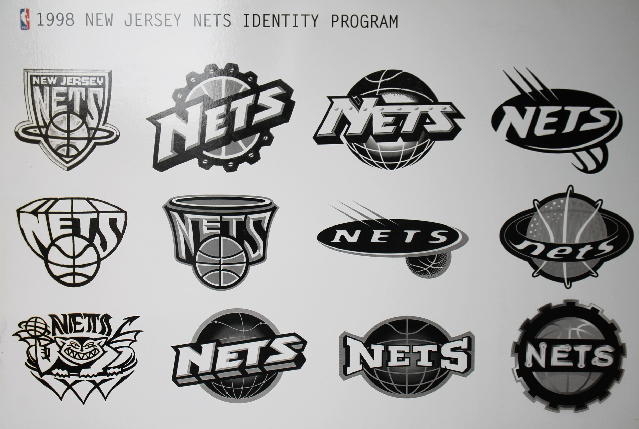
As O’Grady and his team explored more logo concepts, a direction commanding the most attention was a shield shape with an oval rim (without netting), a basketball, and a bold NETS letting font. The original Nets shield ideas were similar to European soccer clubs’ icon patches, an effective solution for the many applications team logos must be carried through as all elements are self-contained. One advantage the NETS identity has is a short name and the additional benefit of not having to incorporate NEW JERSEY into the primary logo design.
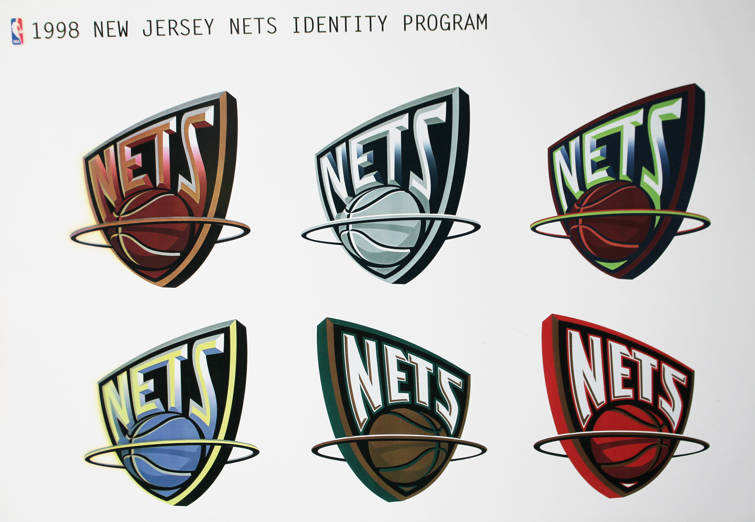
THE 3RD DIMENSION LOGO.
A transformational design breakthrough on the Nets logo came when O’Grady incorporated a 3-D perspective of the 2-dimensional Nets shield logo. Altering the logo into a 3-D perspective provided a more interesting view of the artwork. The beveled NETS font along with the angular shield shape and dimensional ball entering the rim gave the logo depth and density, a look unique to pro sports designs. The Nets logo was presented to New Jersey senior executives who approved the design without any changes. The colors of navy blue, red, battleship grey, and metallic silver addressed the Nets request for a classic “corporate" feel to the logo.
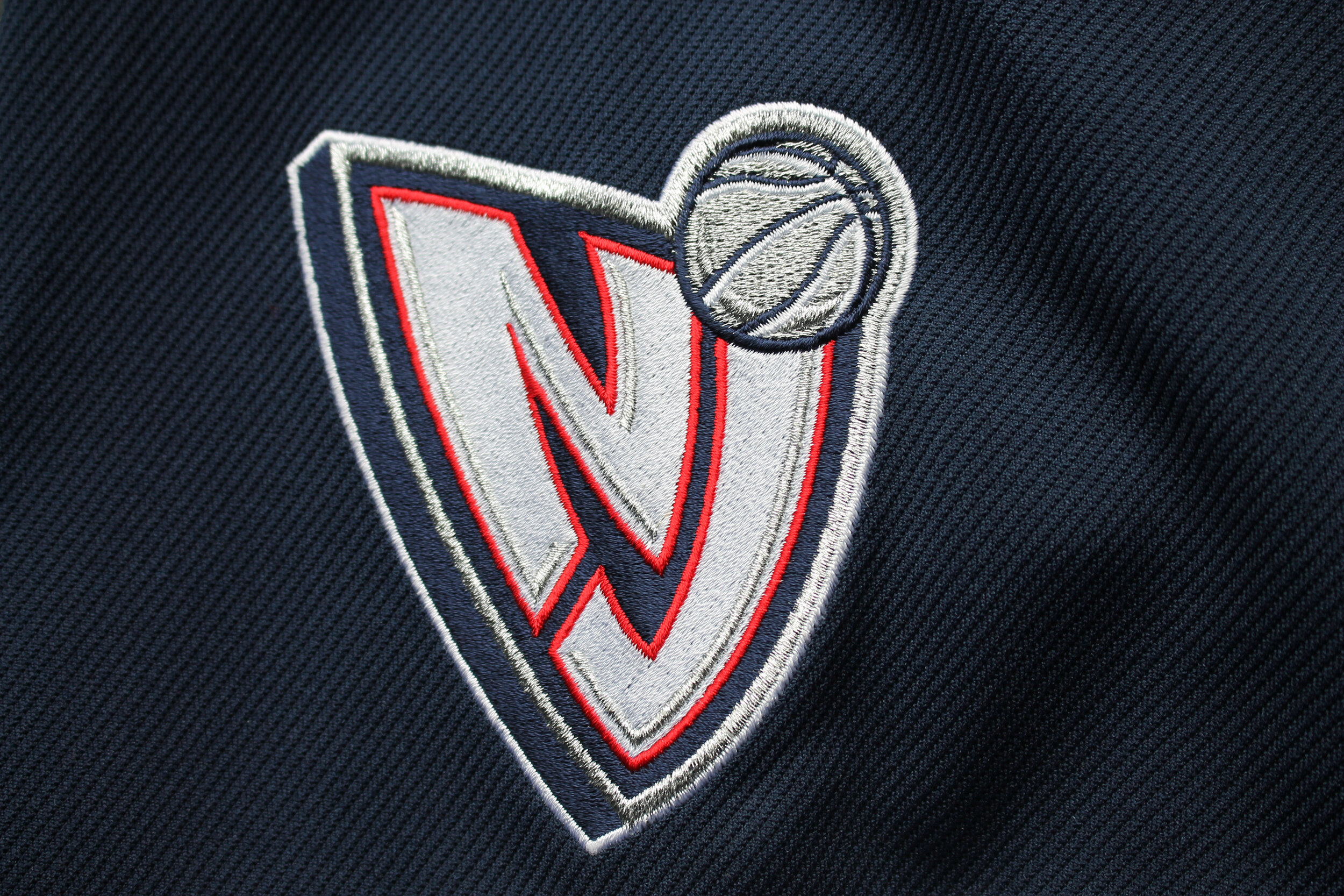
THE NJ SECONDARY LOGO.
While the new Nets primary logo did not have NEW JERSEY incorporated into the design O’Grady’s team created an NJ secondary logo reflective of the Nets shield logo. The NJ logo reminded fans the Nets were New Jersey’s team and the NJ logo became very popular within the local Jersey marketplace.


Once logos were approved, it was important to the team the uniform would present the Nets in the most professional and timeless look possible. The Nets brand suffered some short-term collateral damage with the Swamp Dragons rebrand experiment. The Nets even suggested creating the “New York Yankees” of basketball uniforms with possible pinstripes. Ultimately, the final design of the new Nets home white uniforms and navy blue road uniforms did not exactly match the Yankees uniforms. In fact, the Nets uniform designs were more interesting, not relying simply on pinstripes, interlocking NJ’s or a dominant navy blue color only.
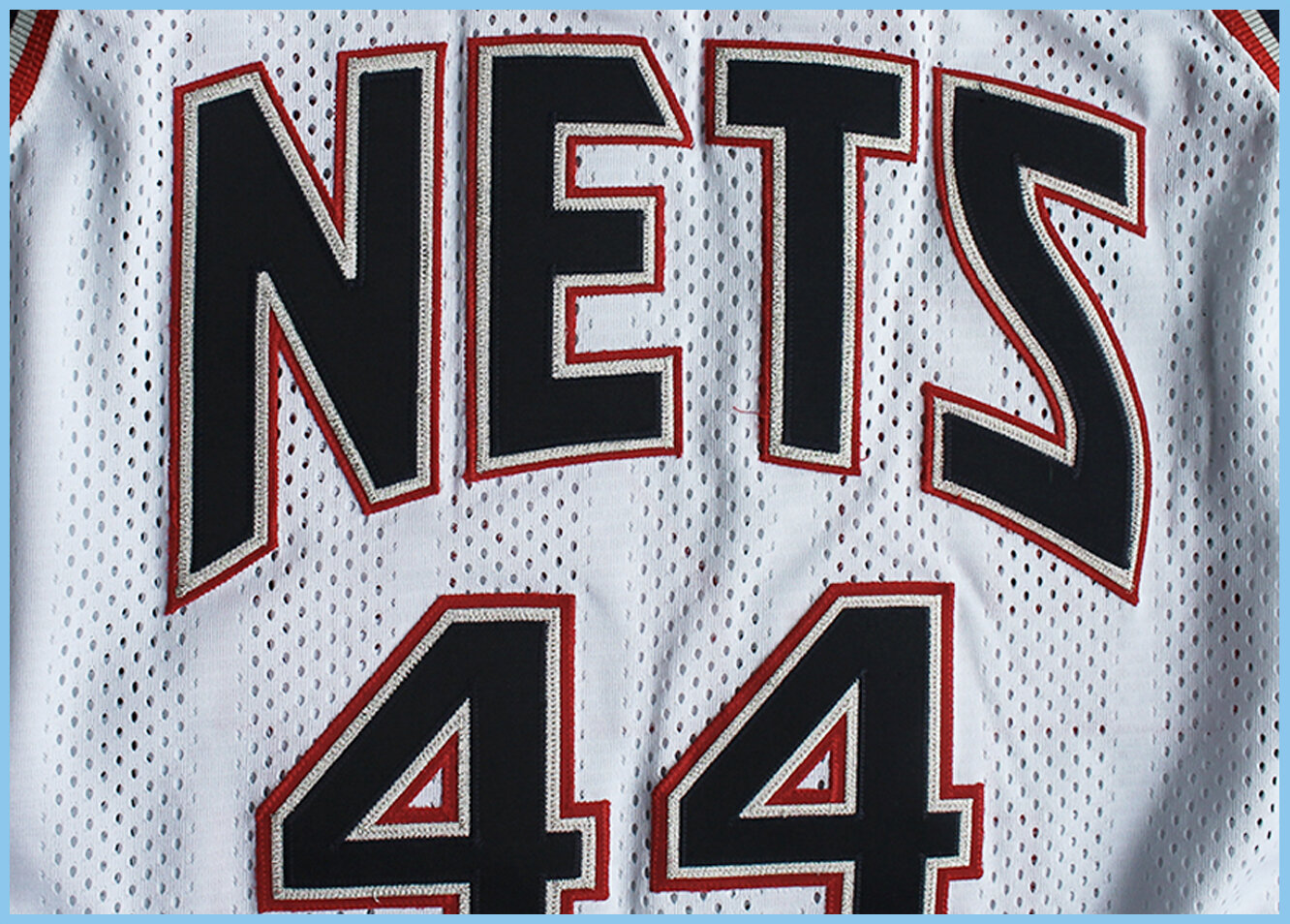
The home uniforms featured NETS on the front with a subtle matte/gloss pattern within the fabric and featured an interesting navy blue side panel with a repeating silver diamond pattern down the side, which suggests the netting. The player three colors numbers featured a silver thread which challenged Champion’s production team to accomplish this difficult design enhancement (which they nailed!). The NJ secondary logo was applied to the left front of player shorts.

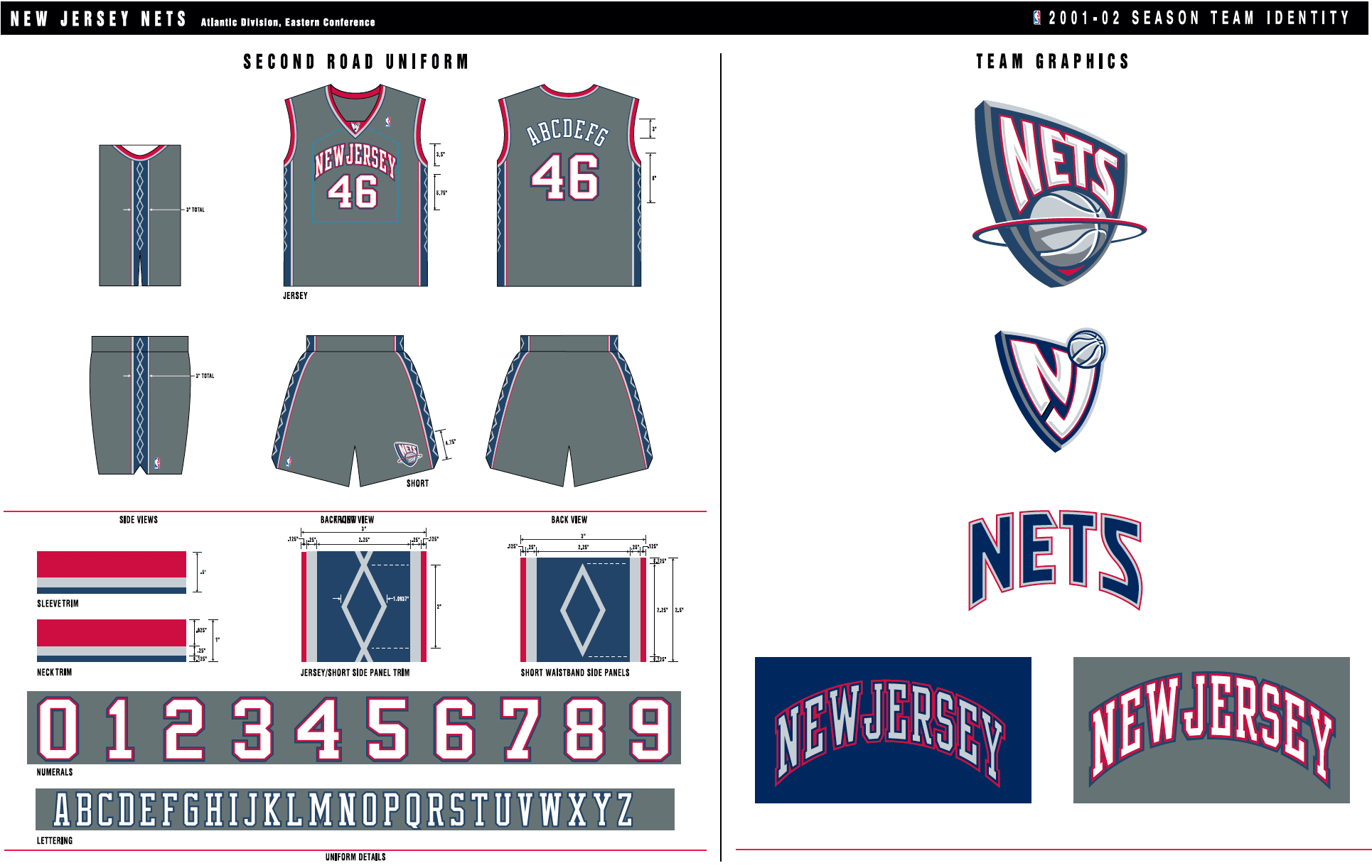
The road uniforms featured a beautifully rendered NEW JERSEY arched font in brushed metallic silver on the front with a navy blue side panel with a repeating silver diamond pattern along the jersey and shorts. The Nets primary logo was applied to the left front of player shorts.
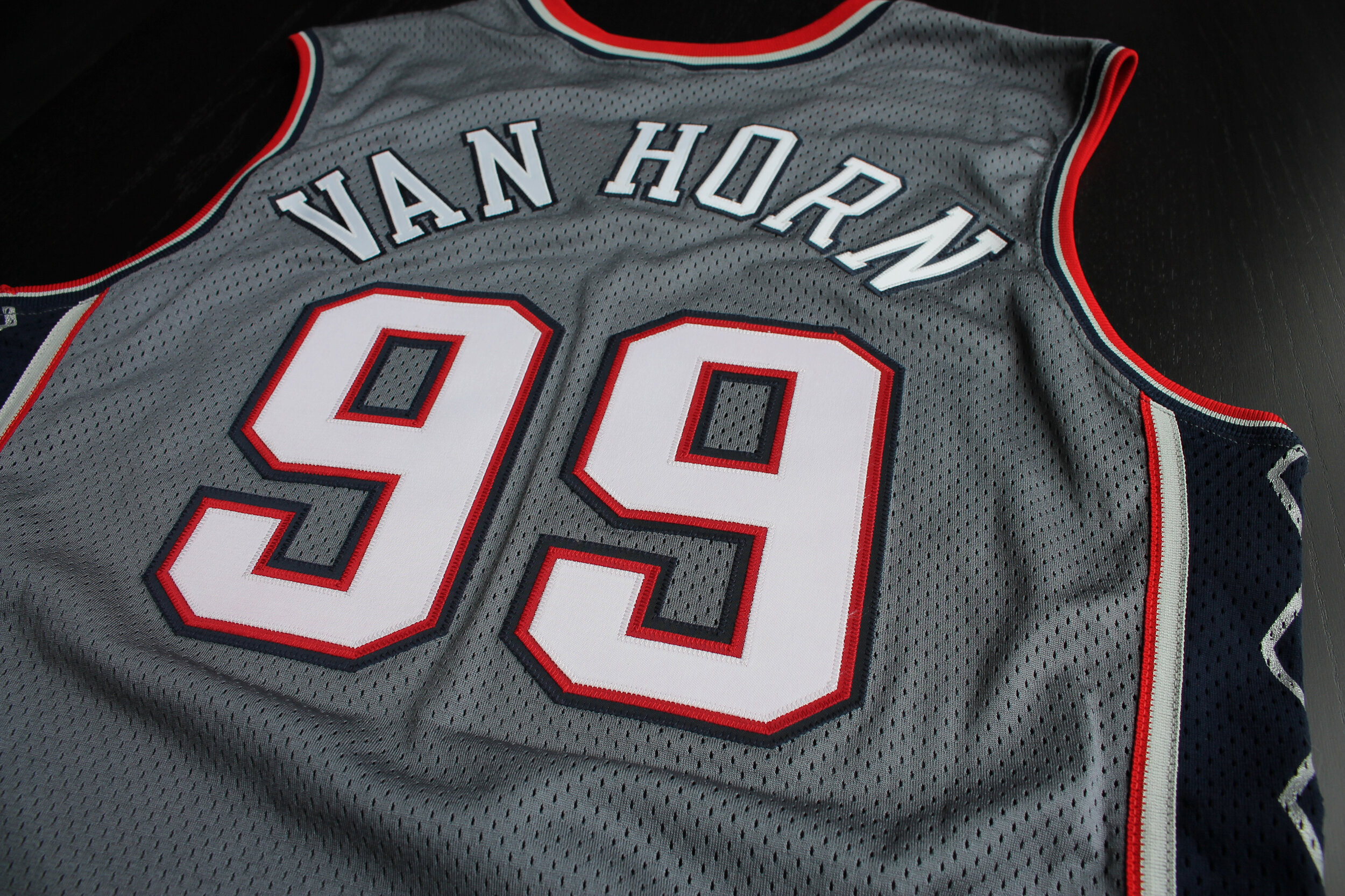
A GREY SUIT OR GREY BASKETBALL UNIFORM?
As part of the rebranding of the Nets, NBA Creative Director Tom O’Grady presented a battleship grey alternate road uniform. The Nets immediately approved the design and the uniform was added as an official alternate uniform a year later. Today, the battleship grey alternates of players Jason Kidd and Vince Carter are some of the most sought-after Mitchell & Ness Nostalgia Co. throwback jerseys.


HELLO BROOKLYN NETS.
After many failed attempts to generate a large and loyal fanbase in New Jersey for NBA basketball, the Nets franchise headed to Brooklyn to play at the brand new Barclays Center beginning in the 2012-2013 season. The black and white branding proved extremely popular with fans in the Brooklyn borough, and that color scheme continues to resonate well with fans as the Nets move into the second decade in the BKLYN.