LOGOMAN BLOG #6 - WINGS UP! WHEN YOU’RE A JET… YOU’RE A JET.


BRIEF NEW YORK JETS HISTORY + SIGNIFICANCE TO NFL EVOLUTION


In 1969, the green and white clad New York Jets changed the NFL forever. The upstart AFL had lost the first two Super Bowls to the establishment NFL with Vince Lombardi leading the Green Bay Packers by lopsided scores of 35 to 10 over the Chiefs and 33 to 14 over the Oakland Raiders. In 1969, the Jets were to face the powerhouse Baltimore Colts led by another symbol of the NFL establishment, quarterback Johnny Unitas. The Jets were led by a flamboyant playboy wearing the white Puma cleats and Fu Manchu mustache, the perfect polar opposite match-up. The Colts were heavily favored with a gaudy 13-1 record in the senior NFL… the Jets were just happy to be there. But one strange (potentially disastrous) thing happened during Super Bowl week.
BROADWAY JOE WILLIE NAMATH GUARANTEES A SUPER BOWL WIN.
The Jets flashy quarterback guaranteed the Jets would beat the Colts.
The promise made national news with sports fans everywhere waiting for the Colts to make Namath pay for his braggadocious statement. Except, one thing happened during Super Bowl III, the Jets played a near perfect game and they defeated the heavily favored Colts, 16-3. Still one of the biggest upsets in NFL history. The game made Joe Namath a household name, during a time where taking on the establishment, dressing outlandishly and playing loose with life was becoming the culture of America. Joe became a symbol of America’s counter culture challenging society norms in place for decades in America.
The Jets victory gave the AFL (American Football League) legitimacy and beginning in 1969 the NFL and AFL were considered equal leagues with equal talent. 57 years later and Super Bowl III in 1969 is still the Jets only NFL Championship. The uniform the Jets wore from 1965 through 1977 was the uniform made popular by the Jets historic Super Bowl upset in 1969.
THE NEW YORK JETS TEAM LOGO HISTORY
The name Jets came from the “Jet Age” and the team’s new Shea Stadium home was between LaGuardia and Idlewild (soon to become JFK) airports.
THE NEW YORK JETS UNIFORM HISTORY
With some minor changes in jersey numbers, sleeve and pants stripping and shades of green, the Jets have had only two really different uniform designs since changing their name and colors from NY Titans to New York Jets. The design of both styles of uniform have been popular with Jets fans and we are not sure the reasoning behind why the team decided to their uniforms in early April of this year. The two primary Jets helmets have gone through minor changes including mask colors and color of the helmets from white to green and back to white.

NEW YORK JETS TEAM IDENTITY REBRAND LAUNCH.
The New York Jets redesign unveiled on Thursday evening, April 4th at a private event in New York City was met with strong feelings about the teams new primary logo, new colors and new team uniform designs. Twitterverse immediately came alive with thousands of posts from Jets and football fans, with some positive but many more negative about the redesign.

That evening, Brigitte Smith, Gameplan Sr. Designer and I were working late on a project and when prepping a post to Twitter we noticed the Jets new identity story TAKE FLIGHT trending and we began to review the different posts (some from esteemed Uni Watch founder, Paul Lukas) and we were struck with how significant the change was, and how it didn’t really look or feel like the NY Jets but more
like North Texas or Marshall college football team identities with the green and black color schemes.
Our team came to a quick and clear conclusion. The new team redesign did not move the Jets brand forward. We concluded the new Nike design actually sent the overall look backwards from the previous identity, which had become a classic. We took to Twitter to provide a uniform critique of the new design and overall it was not flattering. And clearly we were not alone. The all black uniform was panned universally. The JETS are not a team that should ever feature black as part of their identity. BFBS (black for black’s sake) feels like a fad left behind a decade ago.
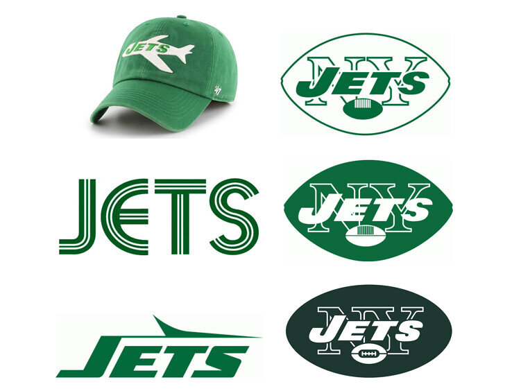
1. NY JETS PRIMARY LOGO – We found a series of small design flaws with the new design which when added up weakened an already fairly pedestrian design solution.
Too much space between NEW YORK and JETS
5 laces on the ball when there should be 8.
The ball covers up too much of the J E T S.
Football shaped oval is redundant w/inner ball.
The J and E are letter spaced too close together.
Too much green around the lettering ball.
An additional inner line in the oval would enhance logo.

2. NY JETS HELMET. We were surprised to see a shiny green chrome helmet for the Jets. The design looked like it belonged to a mid-major college, or another Oregon shiny-things helmet or possibly one of the expansion Alliance of American Football teams which would have been appropriate as they would be wise to attract the attention of difference but it did not match the classic National Football League standard. We thought taking the JETS out the oval and not featuring any stripe down the center of the helmet seemed liked a missed opportunity.
3. NEW YORK WORDMARK. Too big. Too much overkill on an area of the uniform that doesn’t need such large branding.

4. NY JETS ALL BLACK UNIFORMS. The black uniform was panned universally. The JETS are NOT a black branded identity and BFBS seems like something left behind a decade ago…
NEW YORK JETS LOGO BRAND DIAGNOSTIC
Gameplan Sr. Designer Brigitte Smith and I did a quick analysis of the previous Jets logo and discovered some interesting facts and notes about the Jets primary logos.

The JETS are the only NFL team to have a football included in their logo.
The new JETS logo is the only NFL team with a full city name “NEW YORK”.
The RAIDERS and JETS are the only NFL teams with nicknames in their logo.
The JETS are the only pro sports team to have one-color green as their color.
An official NFL football has eight laces, not five, as JETS use in their logo.
And what was our brand design analysis takeaway? The JETS have the most basic, straightforward team logo of all the 32-teams in the National Football League.
From those observations, our team also drew some observations about what JETS could imply as we discussed creating a concept identity for the NFL club, basically we wrote our own creative brief, and acted as our own design agency and client.
The new and previous NY JETS primary logos did NOT include:
A jet within the primary logo (more abstract than the Winnipeg Jets jet)
The use of a second or third color to extend options team partners would have instead of a challenging standalone one-color green logo. Designers don’t count “white” as an official color although it’s included in specs for ink and thread needs.
The use of a football icon for a team which has played in the NFL for 57 years seems unneccessary as fans of the game understand the JETS are part of the League. If JETS were an expansion team, a football would be more appropriate.
The Giants NY, Yankees NY, Mets NY, Islanders NY and the Knicks in the past featured NY… and so did the Jets. Our thought was to move away from an NY and replace with an NYJ to provide their own unique take on NY…
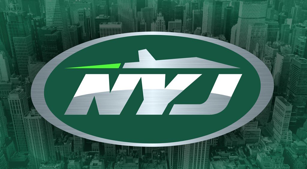
GAMEPLAN CREATIVE DESIGN JETS PRIMARY LOGO
The new Jets logo felt it was missing brand triggers to appeal to football fans and work at retail.
1.) Use the NYJ acronym to appeal to all levels of sports/casual fans.
2.) Feature an oval which appears fast and balanced.
3.) Include a silver fighter jet never featured in the Jets history.
4. Include curved silver horizon line within NYJ suggesting flight.
5.) Add a bright third color neon green jet streak to add movement
6.) Crop tight on elements to maximize negative space conflict.
7.) Use metallic silver to reflect jets structural property.

SIDE-BY-SIDE OF JETS LOGO AND GAMEPLAN CREATIVE VARIATION.
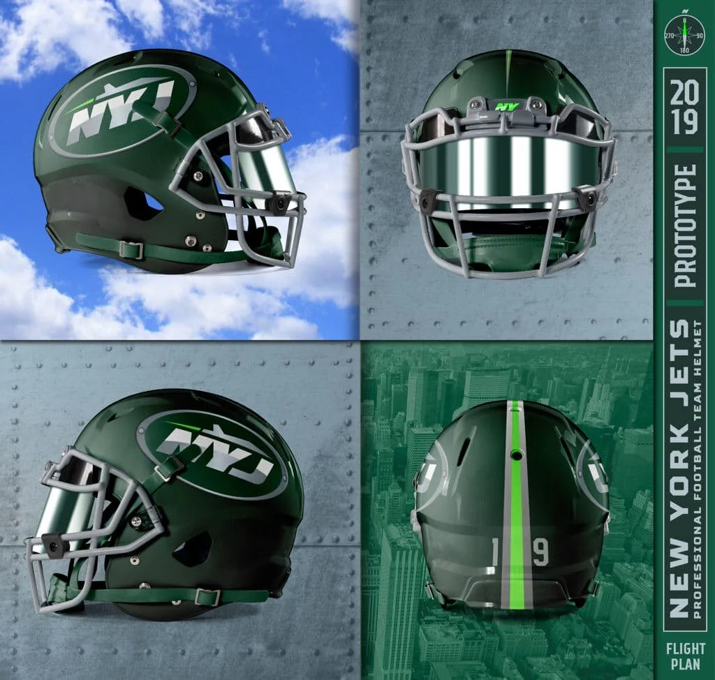
GAMEPLAN CREATIVE DESIGN NEW YORK JETS HELMET
Typically, our agency would create a series of different design options but since this was only a conceptual design option, Brigitte and I went with one strong idea.
Gameplan Creative design highlights were:
Feature a fighter jet plane, not a commercial passenger plane.
Use a brushed silver treatment for the helmet shell.
Apply the NYJ new logo sticker adding a few faux bolts graphics.
Add a green facemask and chin strap onto the new helmet design.
Complete design with a faux runway helmet stripe down the center.
The helmet numbers are intended to match the team jersey fonts.


Add a J that fits the NY

Merge the NYJ w/current football

Is the football shape right?
THE UNIFORMS

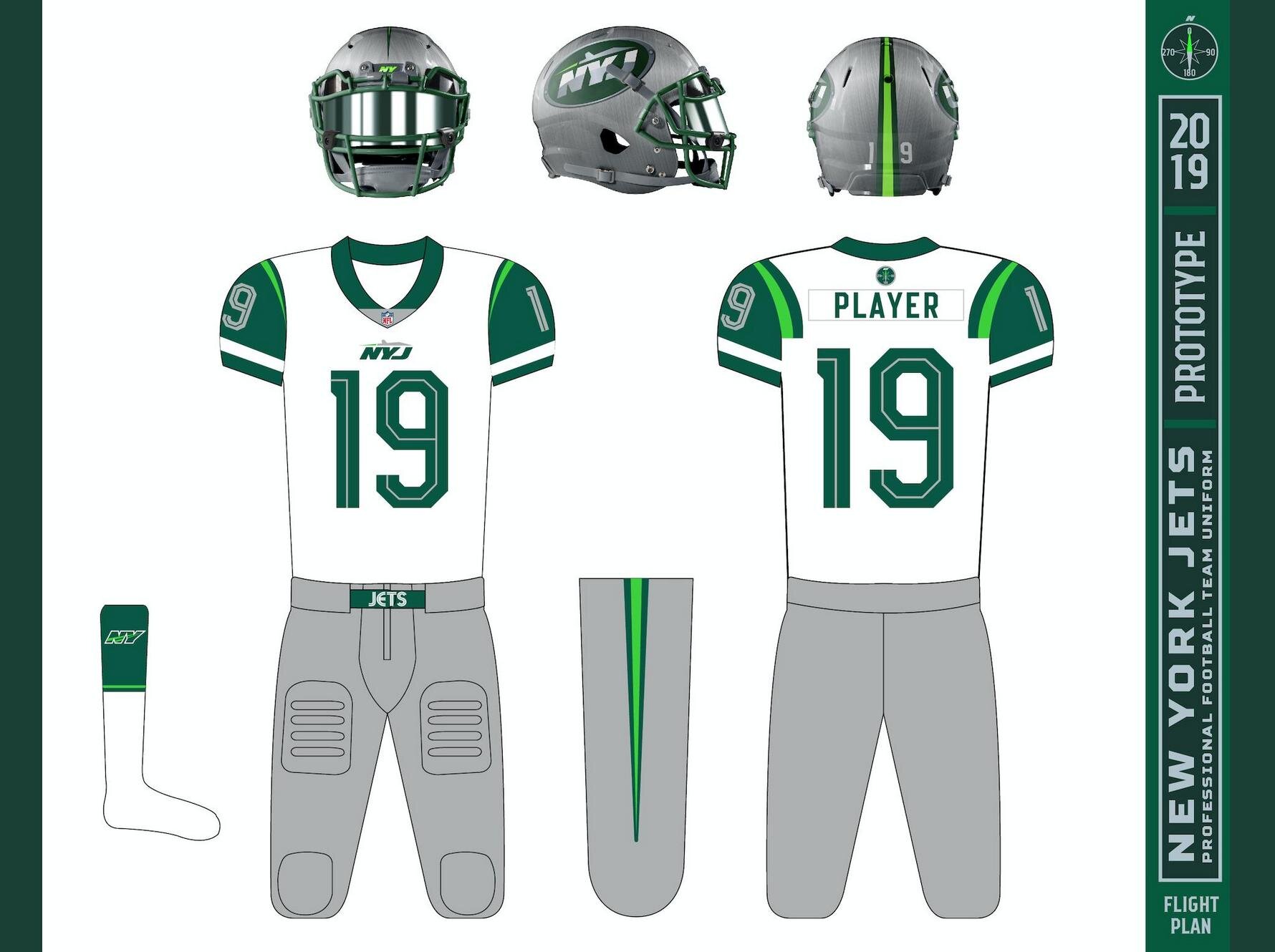
ALTERNATE HELMET DESIGN
BUMPER (SILVER HELMET)


NUMBERS
Option 1

Option 2

“JETS” COMPASS

SUMMATION
A redesign concept project like Brigitte Smith and I tackled on the Jets rebrand is a great pleasure for a designer as you are outfitter, agency, team and league with NO restrictions. This frees up the designer to explore possibilities without owner input, team brand police or over aggressive licensees trying to put their own spin on a team design that should flow naturally and with relevancy to the region, history and fan passion of which the Jets fans have NO shortage (a very good thing!).
