LOGOMAN BLOG #7 - NUGGETS OF WISDOM. COMMISSIONER STERN AS IN LEARN.

THE PIONEERING ROLE OF COMMISSIONER DAVID STERN IN NBA LOGO AND UNIFORM DESIGN.
January 7, 2020 - Originally published at Studio Stories a regular column from Tim Newcomb that explores the stories behind some of the designs dominating the sports landscape. Follow Tim Newcomb on Twitter at @tdnewcomb.

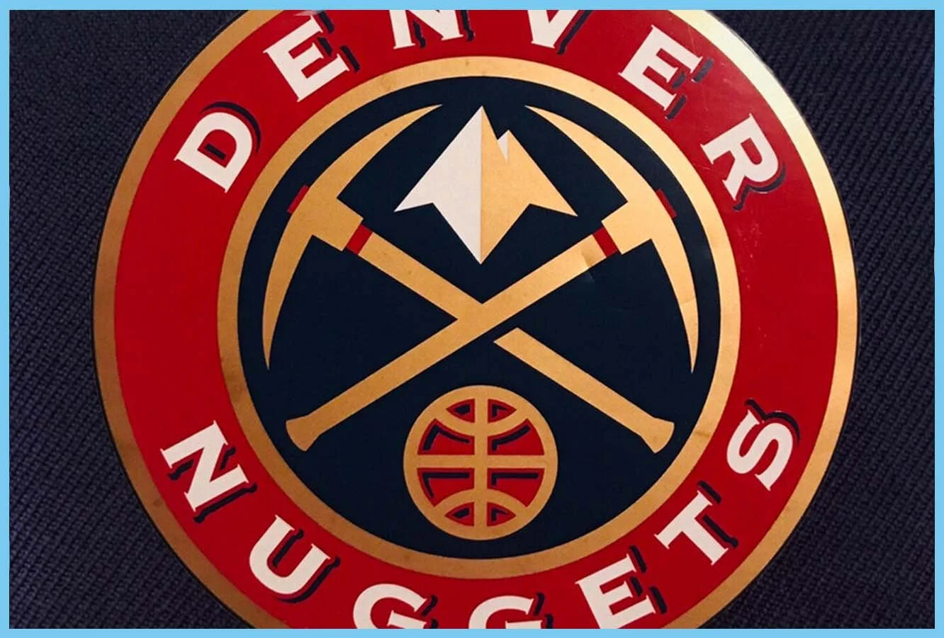
Thomas O’Grady, the NBA’s first-ever Creative Services Director, remembers getting a mysterious beckoning to NBA Commissioner David Stern’s office. When he walked into the New York office in 2001, after having worked with Stern for more than a decade of the eventual 13 years he would be at the NBA under Stern, O’Grady saw final Denver Nuggets-approved logo designs laying on Stern’s desk. O’Grady didn’t know what the problem was.
“He just went off,” O’Grady says, “like a truck driver on a shipping dock.” Minutes later Stern had Denver’s owner, Stan Kroenke, on the phone telling the owner he had never seen the approved logos until now and he didn’t think they were good enough, talking Kroenke into shelving the logo. “He literally stopped a logo from going through because he hadn’t seen it internally first,” O’Grady says. While the pickaxe and mountain logo of the Nuggets started to surface a few years later as a secondary logo and the team’s current logo is basically that 2001-designed mark with a few minor tweaks, the fact that Stern was inadvertently left out of the loop during the original process meant the logo spent years mothballed. “It speaks to his sometimes-eccentric way of approaching a business,” O’Grady says. “It was a very interesting working environment.”

Stern rejected Nuggets change in 1998 but team brought it back in 2006 in powder blue palette.
Stern, NBA commissioner emeritus, who passed away Jan. 1, 2020, having served the league from 1984 to 2014, was instrumental in nearly every aspect of giving the NBA a growing presence, especially in the league’s skyrocketing growth in the 1990s. And that included his micro-managing style that may have killed a Denver logo because he wasn’t properly informed, but greenlighted countless groundbreaking efforts, designs, and explorations in the world of logos and uniforms.
“Having the ability to push the edge and to have his support was important to me,” O’Grady says. “We were pioneering in the early 1990’s of NBA league and team branding.”
The NBA had no in-house creative agency until Stern hired O’Grady, who started in June 1990. O’Grady quickly built a team of designers with strong core design backgrounds to help kick off the world of sports design. Through conversations with Stern, the NBA designers started to approach both the NBA and individual teams how a corporation would develop their branding. “For David to allow us to start to hire people to address this explosion was a testament to how important the NBA brand was to him,” O’Grady says.
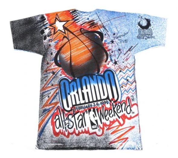

Local color & flavor was incorporated into NBA All-Star designs beginning with Orlando 1992.
Shortly following the creation of the NBA in-house creative agency, O’Grady saw how serious Stern was about the effort. From taking less than five minutes to approve O’Grady’s plan to incorporate plenty of local color and flavor into NBA All-Star Game uniforms, logos, and designs — which kicked off with the 1992 NBA All-Star weekend in Orlando and really took its most expansive shape during the 1995 weekend in Phoenix — to the hands-on process of updating the New York Knicks’ logo and brand in 1991.

Under Stern, NBA All-Star events began designing to reflect elements of the host city
For NBA All-Star Games, the NBA in-house creative agency was soon designing multiple logos for the game itself, game uniforms in local team-flavored aesthetics, a new court design, courtside signage, LED ribbon boards, arena graphics, ticket designs, designs for a variety of events surrounding the game and plenty more. The All-Star formula lived on well beyond O’Grady’s time at the NBA and really broke ground on how a sports league’s jewel event could be visually packaged.
“I am sure Commissioner Stern would have been very proud, as everyone who worked on these projects are, to see the popularity of the NBA All-Star Games graphics and the unexpected huge revenue companies like Michell & Ness are making from ASG vintage clothing sales a quarter-century later,” O’Grady says.
That Knicks project, though, being in the backyard of the NBA, Stern’s favorite team and the league’s most high-profile team at the time, opened the floodgates “to really flex our muscle and really start using our creative team for outfitting and team branding,” O’Grady says. The Knicks updated the main logo and uniforms but also created a secondary “NYK” subway token logo that became incredibly popular and was one of the first times a team launched a secondary logo as part of a branding identify. It all opened up a new world to sports design. Stern then allowed the creative team to take on more responsibility to help fuel the fire of the league’s growing popularity.


Secondary branding took off in the 1990s with the Knicks subway token as a pioneer
“Today, the use of secondary team logos, partial marks, tertiary icons, and wordmarks are commonplace, but circa NBA 1991, we were team brand pioneering,” O’Grady says. “Soon after, these logo descriptions became part of the exploding team identity vocabulary for the NFL, MLB, NHL, as well as the NBA.” Stern led all that. “He allowed us to do things that if you were out on your own submitting these ideas, it would be tough to sell,” O’Grady says. “He had his hand in everything. He would see all the presentations. I would walk in with three to four designs and he wanted to know the reasons why the one I suggested was the best one. He would make sure we had everything covered. He was very much hands-on.”
Once the Knicks and All-Star saw early success, that allowed O’Grady and his team to have some fun with non-conventional designs, whether the uniform sublimation that grew popular in the ‘90s to the ground-up identity creations for the expansion Vancouver Grizzlies and Toronto Raptors. “It was fun working with him on stuff,” O’Grady says. “He was pretty demanding, so it would get to be pretty intense, but to have someone who had their pulse on what team branding could do, he was willing to stick his chin out a little bit and do what no one else was doing at the time.”

Further brand extension was experimented with the two expansion clubs in 1995.
The Grizzlies, O’Grady says, offers a prime example of how his team was encouraged to go beyond simply creating a logo and a home and road uniform. Now common, Stern was willing to absorb the additional costs of protecting the images and designs, the production costs and the risk of diluting a new identity by having the team create an entire identity, full of multiple uniforms and three team logos apart from the main identity. “This was a classic David step on the gas and go,” O’Grady says.


Sublimated uniforms featuring large graphics ruled the NBA in the late 1990s
From the work on the Dream Team for the 1992 Olympics in Barcelona that saw the NBA support licensing needs to help promote and sell the team, which, in turn, helped boost NBA interest, to edgy redesigns of the Suns and even the introduction of a sports league’s first-ever website and the NBA’s initially dabbling in alternate color uniforms, the NBA was at the forefront of plenty of efforts. O’Grady and Stern also oversaw the entire design and branding of the WNBA League and teams and the introduction of more design and logo to NBA team courts.
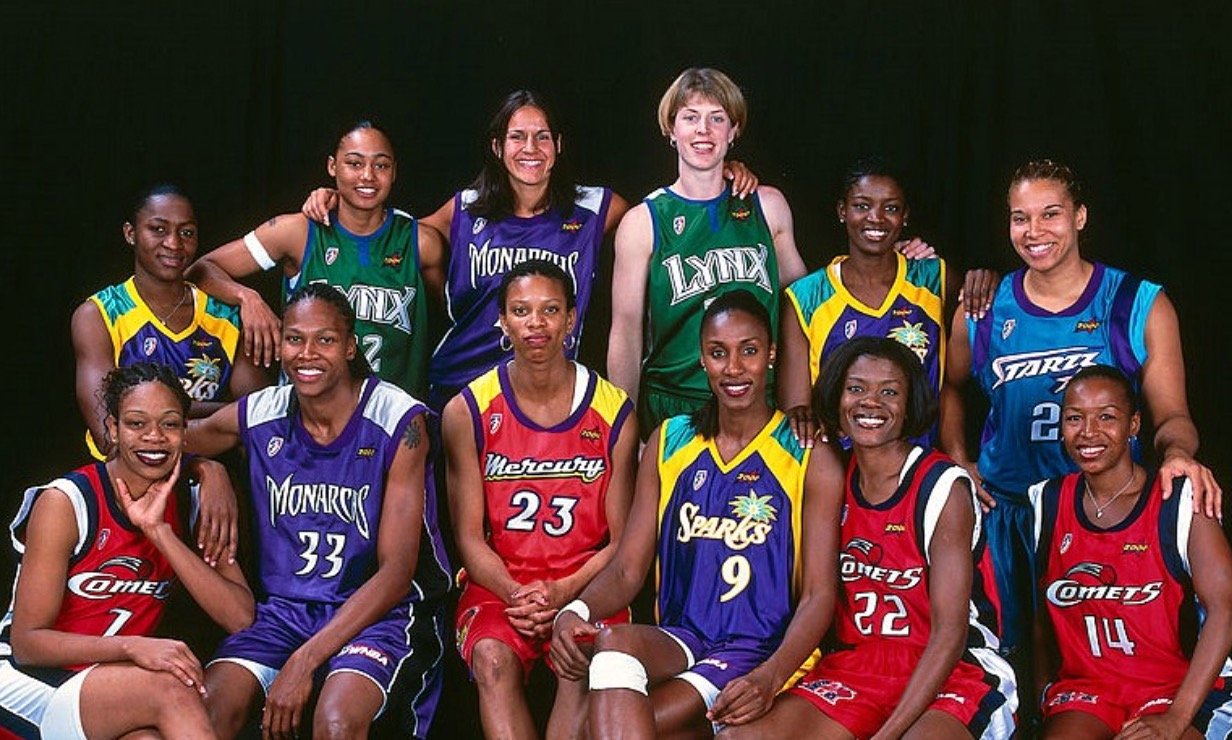

NBA in-house designers followed the very a similar brand approach to the WNBA as the NBA.
As the league continued to grow in popularity and enter culture in a more intrinsic way, Stern recognized the need for teams to have entire brands themselves to monetize teams and the leagues through licensed products, from authentic and replica team jerseys to vintage designs to fashion plays. “David Stern’s mandate was to meticulously review and analyze everything that NBA had produced graphically over the past five years,” O’Grady says about when he joined in 1990, “and assess how the department could improve and ultimately monetize the NBA’s powerful league assets as well as its’ team logos, team uniforms and courtside apparel, such as warm-ups, shooting shirts and new, never before worn courtside apparel items, which could be turned into large revenue generators for Champion, Nike, Puma, Starter and other partners through the 1990s.”

While that 2001 meeting in Stern’s office where O’Grady was blasted over a Denver logo that hadn’t yet before made it to the commissioner’s desk, it was that passion for NBA branding and team identity that pushed the NBA into new territory for sports design. “If there was a big shift, David was very much hands-on,” O’Grady says. “I would walk into a room with David and Rick Welts, President of NBA Properties at the time and walk out an hour later a lot smarter. They both had the ability to help me see three or four moves down the field instead of what was right in front of us. I learned to sit back, study and then proceed. He was very good about teaching a lot of us about the game and how to market it.”
