LOGOMAN BLOG #8 - THE REAL DEAL RE: PISTONS TEAL.


BRINGING MAXIMUM HORSEPOWER TO THE MOTOR CITY.
In the summer of 1995, at the apex of the revolutionary visual period in NBA logo and uniform design, the traditionally conservative Detroit Pistons wanted to be part of the bold, bright and animated trend underway in pro basketball. Detroit Pistons President Tom Wilson reached out to NBA Vice President, Creative Director and overseer of NBA team identities Tom O'Grady to seek his advice in rebranding one of the League's oldest franchises. O’Grady was honored and excited to have the opportunity to work with the Pistons and breathe new life into what had grown to be a stale and dull team identity.

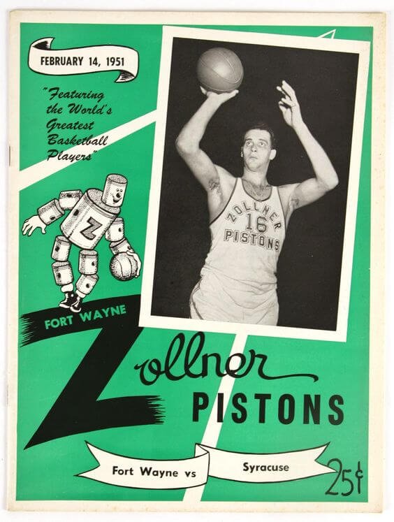
THE FORT WAYNE ZOLLNER (DETROIT) PISTONS.
Founded in Fort Wayne, Indiana, in 1937 as a semi-professional company basketball team, the Pistons would turn professional in 1941 as a National Basketball League (NBL) member, winning two NBL championships in 1944 and 1945. The Pistons then joined the Basketball Association of America (BAA) in 1948. The NBL and BAA merged to become the National Basketball Association (NBA) in 1949 with the Pistons becoming part of the merged League. In 1957, the franchise moved from Ft. Wayne to Detroit. The Detroit Pistons have won three NBA championships: 1989, 1990, and 2004.
ONE OF FOUR PRO TEAMS NAMED AFTER A PERSON.
Initially, the team was known as the Fort Wayne Zollner Pistons. The teams' names came from team owners Frank Zollner and his sister Janet's company, the Zollner Corporation, a foundry that manufactured Pistons, primarily for cars, trucks, and locomotive engines. An interesting footnote, the Ft. Wayne Zollner Pistons are one of only four professional teams ever named after a person. The Cleveland Browns are named after their original GM and Head Coach, Paul Brown. The Buffalo Bills are named after Buffalo Bill Cody through a naming contest. The Chicago Blackhawks are named after Sauk leader and indigenous warrior Black Hawk and the 2004 expansion NBA Charlotte franchise was named after the team's owner Robert Johnson decided to use his short name “Bob” with “cats” becoming the Bobcats. Hard to make that up!
A TRADITION OF ROYAL BLUE AND RED PISTONS UNIFORMS.
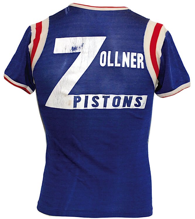


In the early years of the NBA, teams wore a limited amount of different uniform colors, with royal blue and red being the two dominant team colors. There were exceptions such as the Boston Celtics classic kelly green and white and the Minneapolis Lakers light blue and gold. However most teams stayed in traditional royal blue or red uniforms with contrasting trim and arched font lettering. No NBA team has played more seasons in royal blue and red uniforms colors than the Zollner/Detroit Pistons. Beginning in the mid-1940s, the Fort Wayne Zollner Pistons wore royal blue and red trimmed tank tops and shorts with basic designs, typical of sports teams in that era.


From the mid-1940s until the 1969-70 season, the Pistons NBA franchise stayed true to their royal blue and red colors, only making modifications to their lettering and number styles as well as team trim options on the neck, and sleeves, waist, and shorts. The traditional design was simple and not changing much year-to-year. Simple. Safe. Stock order looking overall stuff.


For two seasons, 1969-70 through the 1970-71 NBA season, the Detroit Pistons changed their road uniforms to a powder blue uniform shade with red lettering, numbers, and trim, marking the first time the team had not to worn royal blue as their primary uniform color. The uniform broke out of their royal blue and red color scheme and arguably looks more contemporary than the Pistons uniforms the team wears today as powder blue has become a very popular color in sports.


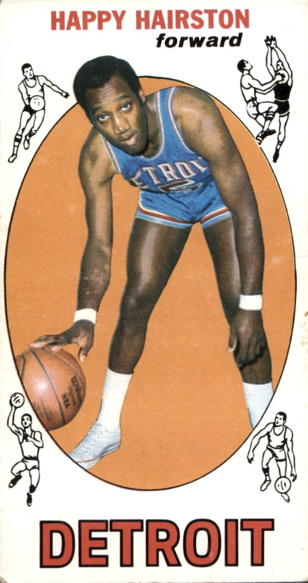
The Pistons returned to royal blue and red at the beginning of the 1972-73 season. During this era, two of the Pistons greatest players and Naismith Basketball Hall of Famers, Bob Lanier and Dave Bing, played most of their careers in the familiar royal blue and red Detroit uniforms.


PISTONS SEE RED. THEN STRUCK BY LIGHTNING.
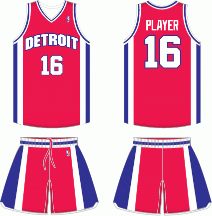
In 1976, as the United States celebrated its bicentennial anniversary, the NBA Detroit Pistons radically changed their traditional royal blue with red trim uniforms and changed to a bold red uniform featuring wide symmetrical white side panels with a thick blue insert on the jersey and shorts, providing the team with bold and fresh looking uniforms. The new red uniforms were worn for two seasons. Detroit would not wear a primary red uniform again until they sported red alternate designs in the 1994-95 season, 16 years after wearing the original red Pistons design.
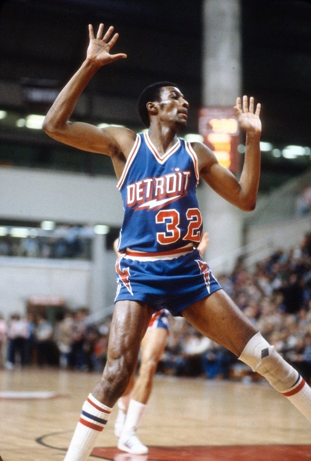


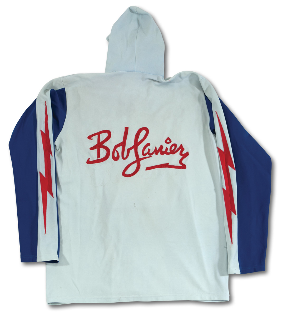
In 1978-79 the Pistons re-introduced royal blue and red uniforms but this time they featured eye-popping bold red lightning bolts with white outlines along the sides of the jerseys as they cascaded down to the sides of the game shorts. The new italicized DETROIT lettering included a lightning bolt underneath it with big, bold red numbers with white outlines on both the front and back of the uniforms. The familiar Detroit Pistons "Lucky Strike" cigarette pack logo appeared on the left, fitting shorts within the split lightning bolts. Additionally, the Pistons wore one of the most outrageous warm-ups in NBA uniform history when they wore a grey hooded snap front with navy blue sleeves separated by a red lightning bolt. For a club steeped in simple uniform traditions, the lightning bolt designs electrified NBA courts across the League.
THE 1980's DETROIT PISTONS "BAD" BOYS WERE A "VERY GOOD" TEAM.


In the 1981 NBA draft, the Detroit Pistons chose Isiah Thomas with the 2nd overall pick. Thomas started for the Eastern Conference in the 1982 NBA All-Star Game and made the All-Rookie Team. Over his career “Zeke” would be recognized as one of the top 50 NBA players of all time! The Pistons who had struggled for decades on the court and finally found a their messiah --- a point guard who would quarterback them on their rapid rise to respectability. While the 1980s NBA were primarily known for the Celtics vs. Lakers rivalry, Larry Bird vs. Magic Johnson, the stratospheric rise of Air Jordan in his Nike basketball shoes and commercials, the Pistons would also make their impact on arguably the most important decade in NBA history.


The 1980's Detroit Pistons were a great basketball team and by the end of the decade, the Pistons had captured back-to-back NBA Championships. However, the late '80s Pistons are often more known for their “Detroit Bad Boys” basket-brawl style of play and frequent displays of poor sportsmanship. Doubling down on their brawler image, the Pistons created their own sub-brand logo including a black, silver, and orange skull with crossbones logo, which the Detroit Pistons merchandised at team home games.

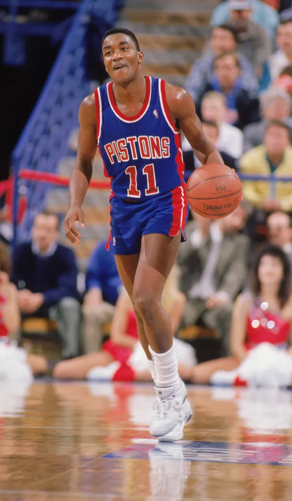
Coinciding with Thomas being drafted in 1981, the Pistons also debuted simple new uniforms. Those uniforms have been basically the same design and colors since except for four seasons from 1996-97 to 2000-01. The standard Piston's bold red and blue side panels with the arched lettering PISTONS on the white uniforms and the double red stripes on the royal blue uniforms scream "DETROIT BASKETBALL.” And that traditional Pistons blue and red look continues to be the ongoing "unofficial" look of the teams’ brand identity.
There was a four-year period from beginning in 1996 where the Pistons would make a drastic change from their basic blue and red identity. In 1995, with the Pistons' infamous "Bad Boys" era a thing of the past, the Pistons were looking for a fresh start to their image. Detroit was no longer at the NBA pinnacle of contending NBA teams. It did however have a new franchise player in Grant Hill from DUKE. As the Pistons were transitioning to a new era the organization took notice of the growing number of bold, colorful and popular rebrands the NBA and their in-house agency NBA Creative Services was producing in the early 1990’s, which rapidly was changing “the look of pro basketball”.
Tom Wilson, former Detroit Pistons President, decided might be the ideal time to shaking things up visually for the team and mulled over having his Pistons go through a complete rebrand. The timing coincided with the NBA’s suggestion to present to teams whose team logos and uniforms had been the same for an extended period and become dated-looking. The pitch to the Pistons: drive not only core Detroit fans but casual basketball fans to purchase merchandise with new team logos and colors and take full advantage of the exploding sports licensed products category.
In the late ‘80s, sports apparel was becoming BIG business as urban brands looked to the four major sports for their bold colors and team logos as a new fashion trend. At that time, the NBA had more than its' share of traditional NBA blue and red team logos and uniforms. The NBA's VP/Creative Director, Tom O'Grady was overseeing fan focus groups in different markets and developing fashion “look books” on sports licensed apparel. In 1995, teal, purple, black, and metallic silver were by far--- colors fans were responding to, especially younger fans --- a demo the NBA heavily focused on. The NBA presented these findings to Tom Wilson and then Pistons marketing staff making a compelling case to go through with an entire rebrand. Detroit was known for its blue and red, but the team realized the time to evolve its’ identity was overdue.
A HOOD ORNAMENT. A GEAR. AND PISTONS HORSEPOWER.


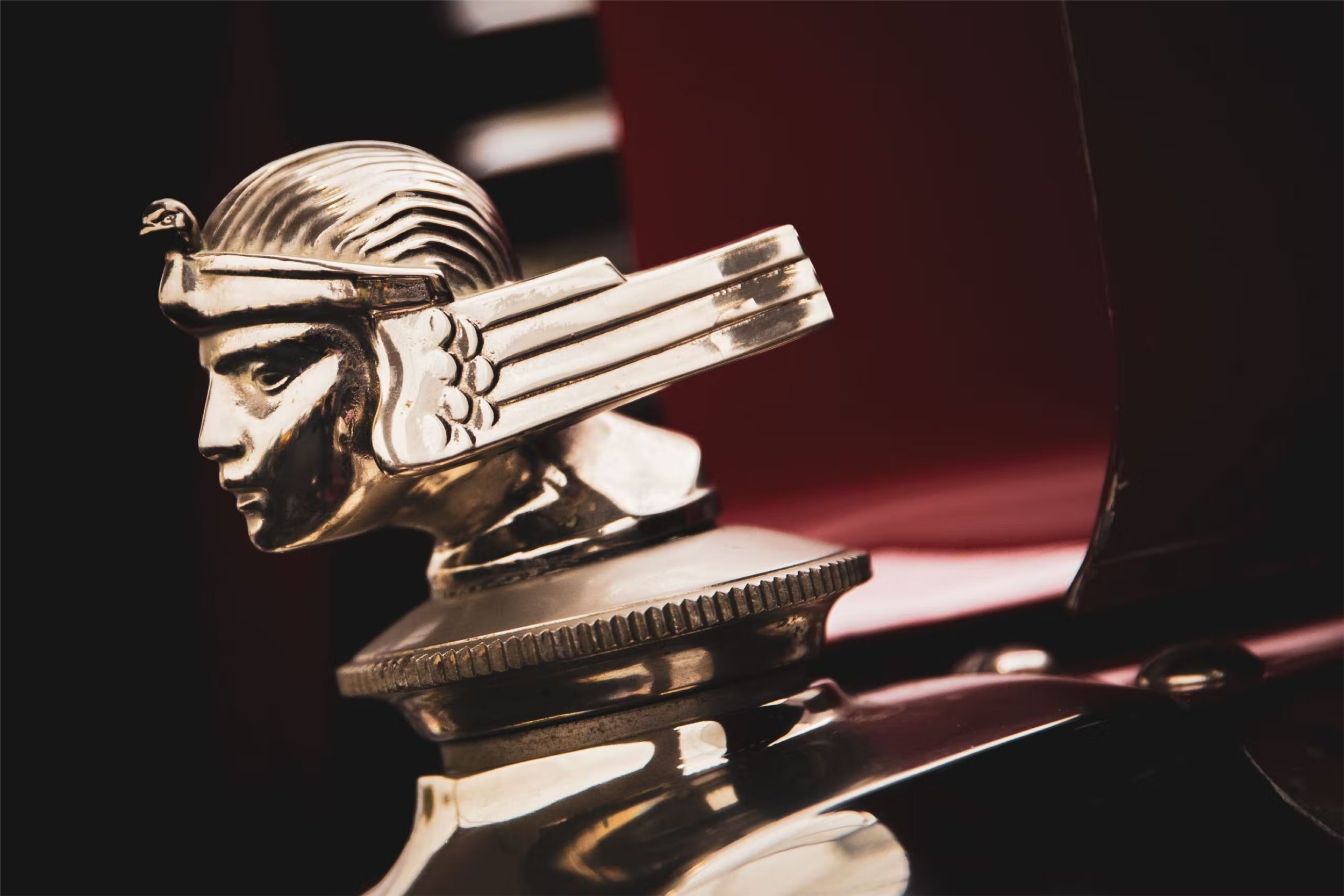


The Pistons submitted their application for the rebrand and O'Grady and his NBA Creative Services group got to work overseeing a team of graphic designers in the pursuit an entirely new identity for one of the NBA’s original franchises. At the onset of the project, a series of concepts were developed, including a 1920’s stylish Rolls-Royce hood-ornament idea. Another direction, a "Detroit Bad Boys" concept with a skull and a crossbones parody version featuring a six-sided wing nut with two crossed wrenches inside a gear inspired by the rock band Bachman-Turner Overdrive's logo. Finally, a horsehead a metallic chrome PISTONS font with tailpipe flames positioned in front of a basketball developed to "re-ignite" the Motor City brand.
PISTONS TRADITIONAL RED AND BLUE IDENTITY MAKES A U-TURN.


Late in 1995, NBA Creative Services made their final presentation to the Detroit Pistons' upper management. The team chose the horsepower concept but with teal, black, red, yellow and silver as new team colors. This breakthrough color scheme was driven by NBA Creative Services who understood the marketing and merchandising potential of the new Pistons logos, uniforms and bold new colors. The Pistons upper management was excited but nervous about such a radical change but their long-time and highly respected owner Bill Davidson approved the designs ---even with the understanding there might be some initial push back from long time Detroit fans.
The new Detroit Pistons brand identity program included:
PISTONS primary logo.
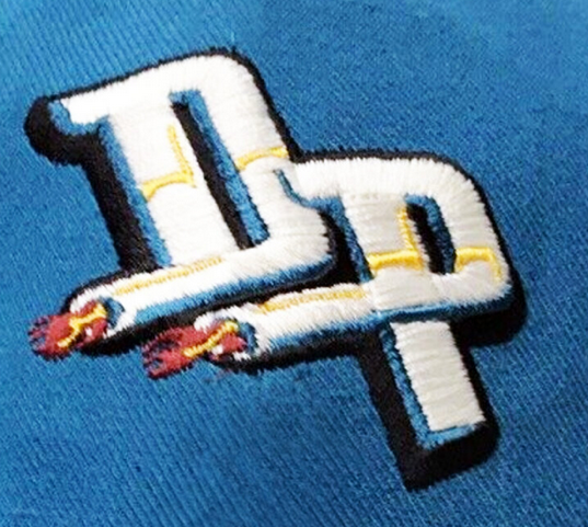
Secondary DP logo.
PISTONS uniform lettering.
A partial horse/basketball design
These four elements became the core brand architecture for the team. The new team identity was distributed via printed logo sheets to NBA licensees, media, and broadcast partners. By creating a "peelable" Detroit Pistons primary team logo, parts of the primary logo are able to be repurposed as partial logos without the substantial costs of trademarking. Alternate teams logos and wordmarks produced large revenues to Pistons local sales and to the NBA and its licensees.

There is a strategic design process when creating an NBA team uniform. Beginning in the late 1980’s there was a concerted effort to start using a team logo lettering on the front of team uniforms. For Detroit, the Pistons lettering from the primary logo was “peeled” out and applied to the front of the home white and road teal uniforms. This “extending the brand” creates consistent impressions of the teams logo as it’s featured on the uniforms. In the 1990’s the use side panel contrasting color inserts helped create additional “verticality”making very tall players appear even taller! The Pistons lettering was created to look like a chrome lettering on an automobile. The rounded Pistons letters were the visual cues for the players numbers, again working from a center visual theme and pushing it through the entire uniform design. The Pistons DP secondary logo was placed on the lower left front of the player shorts. Finally, the Pistons neck, sleeve, waistband and shorts trim was cleverly designed to match a green/yellow and red traffic light referencing the automotive horsepower concept.


GIVE THE CHANGE A CHANCE.


Changing a professional team's logos and uniforms is a challenging and highly scrutinized brand undertaking. And when the change involves changing a traditional team’s colors, those updates are understandably polarizing. The rebranding process for an identity change (including logos, uniforms, and court designs) typically takes up to 18 months. The NBA established this timeline to provide enough time for overseas production of team's redesigned replica jerseys. NBA Champion (at the time) replica jerseys traditionally are the NBA’s top-selling product. At a team’s logo launch retail outlets must have enough merchandise on hand to address the immediate demand fans have to get their hands on the new “stuff”. The online NBAStore, individual team shops and Fanatics also need the new team logos in many different styles. Additionally, when a rebrand happens, NBA Global Merchandising does not want teams to be left over with much if any inventory of the previous logo.
In the summer of 1996, the Pistons held a big fashion show for fans and the media in the lobby of the Palace at Auburn Hills, the new home of the Pistons in the arena's main entrance and Grant Hill and Allan Houston wore the new teal road and white home uniforms. There was a wide array of new team merchandise and a big bus with the player's pictures in the new uniforms. It was a revolutionary rebrand and finally had put the negative "Detroit Bad Boys" branding to its' final resting place. Time for the Piston's to reveal a modernize, fresh new young, and unique look. The reaction as predicted by owner Bill Davidson from many long-standing Pistons fans and team-beat sportswriters was overall negative.


From 1996-97 to 2000-2001, the Pistons wore the white home and away teal road uniforms. For two seasons, the Pistons also wore an alternate deep red uniform, which quickly became more popular than the teal uniforms since Pistons fans felt the connection with red to their previous uniforms. After four seasons of teal horsepower, the team decided the color scheme did not reflect the true traditional Pistons brand and had the NBA and Nike Basketball design uniforms reflective of their late 1980’s NBA Championship seasons. The teal uniforms were retired into NBA rebranding oblivion --- potentially never to be worn again. They were a short albeit, colorful and bold departure from the traditional blue and red Ft. Wayne/Detroit Pistons branding.
CHAMPIONS ONCE AGAIN IN RED. WHITE AND ROYAL BLUE.


By 2004, the Pistons had rebuilt their team and made it to the NBA Finals. An in a stunning upset, the Detroit Pistons defeated the heavily favored Kobe Bryant, Shaquille O' Neal, Gary Payton, Karl Malone, and Derek Fisher Lakers four games to one capturing their 3rd NBA Championship. No Detroit Bad Boys... no teal horsepower... just a “hard-working” team with no real NBA superstars... just a passionate, talented team coached by legendary Head Coach Larry Brown. Since winning the crown almost 20 years later, the Pistons have stayed with their classic traditional royal blue and red uniforms, making minor adjustments along the way.


In 2015, the Detroit Pistons worked with Nike basketball to develop a grey alternate uniform featuring navy blue lettering, numbers, and navy blue/white/navy blue side panel trim along with the secondary P on the short legs. The design was not definitely not popular with Pistons fans and after one season, it was discontinued. Nike Basketball adjusted the design using the same template from the Pistons white uniforms but replacing the navy blue with royal blue and then sprinkled red throughout the uniform.


In 2018, Gameplan Creative/Sports Design Agency creative director Brigitte Smith was toying with a concept idea and created a Pistons alternate black uniform (the exact same style as the teal horsepower design) and with a gear, wrenches, and six-sided nut basketball on the waistband. The design was posted to the Gameplan Creative Twitter page. Almost instantly, the design began getting a significant amount of Likes and favorable comments --- suggesting a return to the teal and black with the horsepower logo might be due for a big comeback.
#RETURN OF THE TEAL. 150K LIKES ON TWITTER. 110K INSTAGRAM LIKES. 2.7M VIEWS. TRENDING ON TWITTER!
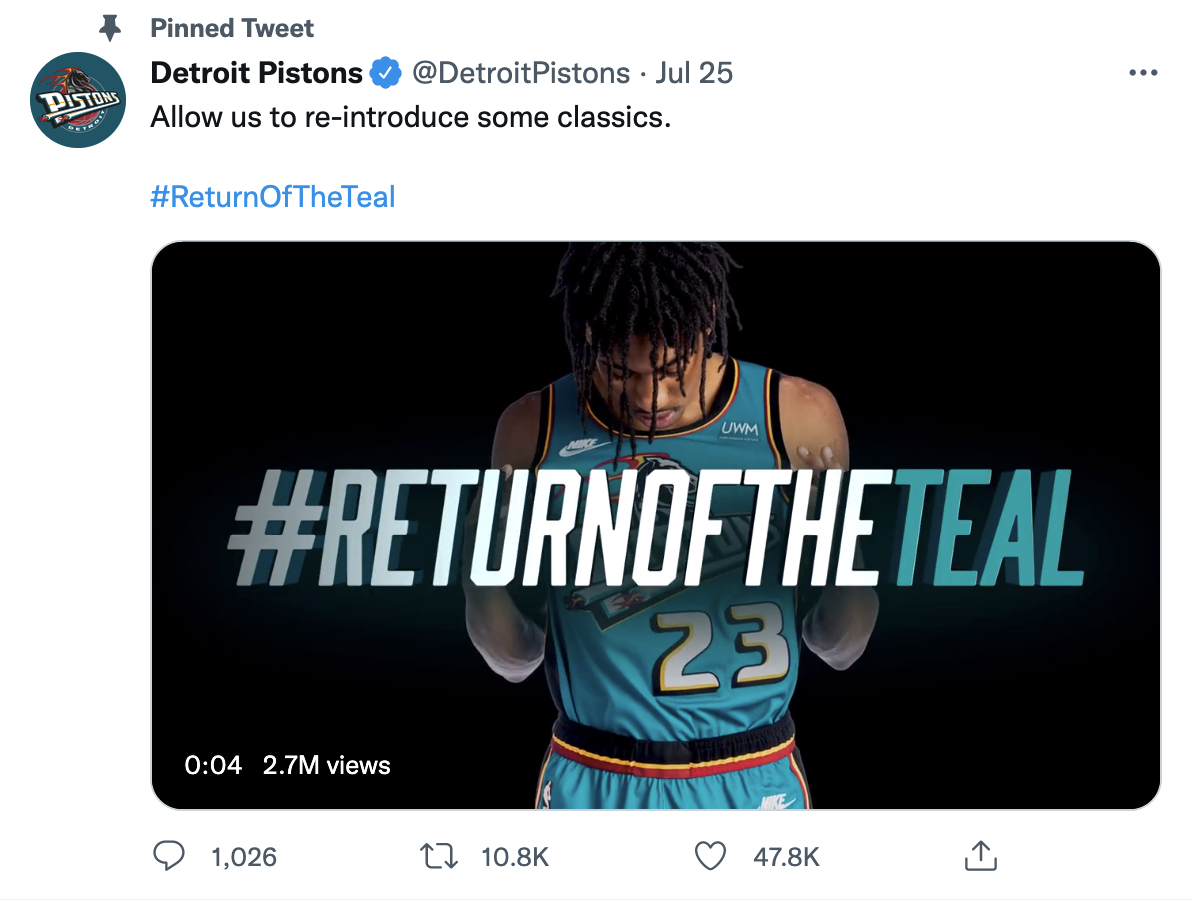

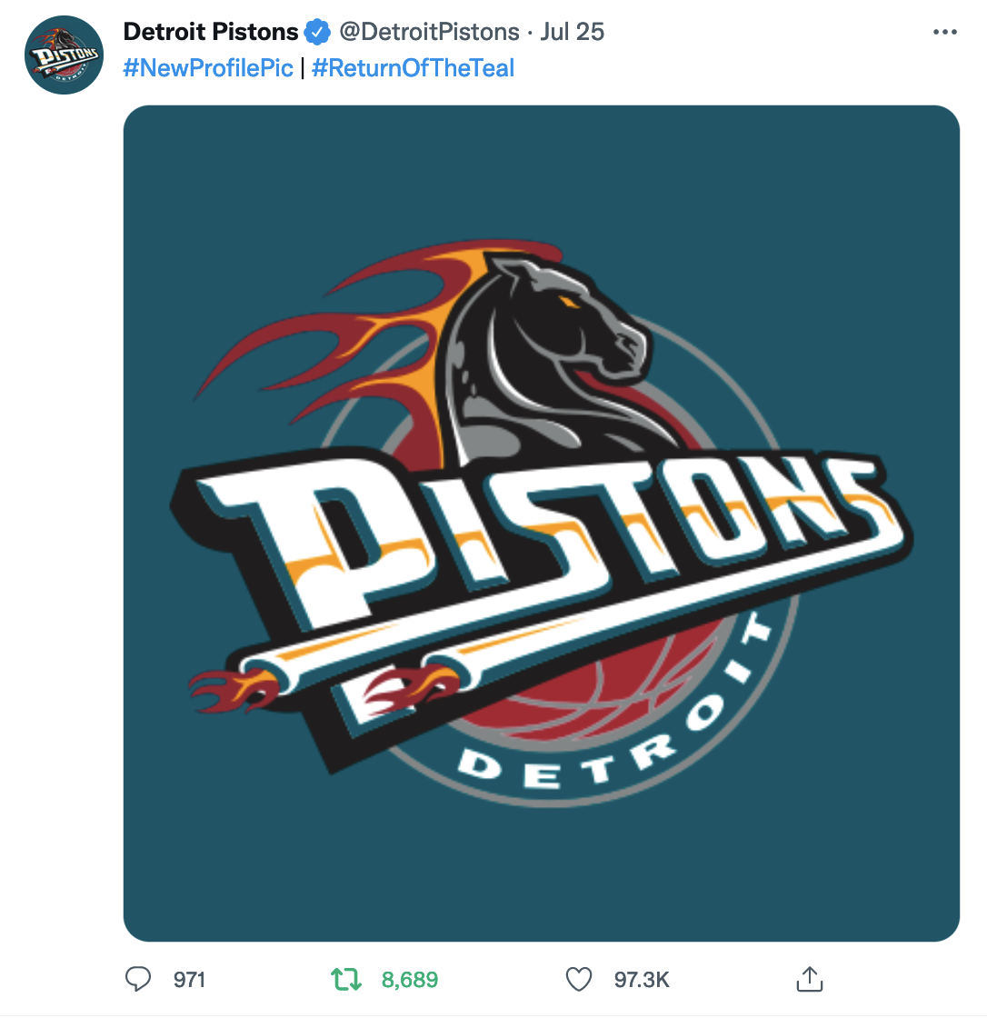


On July 25th, 2022, the Detroit Pistons almost blew up the Internet with a perfect teal uniform shock drop. An incredible 150.0K Likes on Pistons Twitter and 110.0K Likes on Pistons Instagram social media accounts! Numbers like this have never been seen for a new uniform reveal in professional sports. Talk about real teal horsepower!
The Pistons teal horsepower cult favorites will be back in Motown during the 2022-2023 season for an initial one-year run in their original form from 1996-97. Pistons will wear the iconic jerseys for ten games at home as Nike Basketball produces their Classic Edition uniforms.
“We’ve heard the request for the return to teal for years at games, events, and on social media, especially the generation of fans who grew up with it. They’ve asked for it, and we’ve listened. Our entire organization is excited about this retro return to the horsepower era. We have taken notice of fans’ positive response to teams who wore similar bold jerseys in the ‘90s like the Hawks, Suns, Bucks, Grizzlies, Raptors, and Rockets, who’ve brought them back in. Recent years.”
The Piston's expanding millennial fan base has been desperate for the team to inject some life, bold style, and youthful energy into their team. The classic blue and red jerseys are another drab cases of NBA "Bland"-ing (not Branding)... stuck in the early '80s and NOT in a cool way. The bold teal jerseys perfectly address the "retro relevancy" professional teams are seeking today. This thirst for fresh and different has been a 2020's version "Not Your Father's Oldsmobile" takeoff campaign. Pistons younger fans were desperate for something new --- and all they had to do was take a look at the one of the most popular 1990’s NBA uniforms to find their answer!

1957-58 to 1962-63

1963-64 to 1968-69

1969-70 to 1970-71

1971-72 to 1975-76
1976-77 to 1977-78

1978-79 to 1980-81

1981-82 to 1995-96

1996-97 to 2000-21

2001-02 to 2004-05

2005-06 to 2013-2014

2014-15 to 2016-17

2017-18 to (Present)
VISUAL VINDICATION.
The teal horsepower Detroit Pistons was one of the best jerseys from the 1990s. Were those late '90s Pistons teams good? No. But the teal jerseys? An all-time vintage classic, and this is no longer arguable NBA and Pistons fans, social media has weighed in, and the feedback has been overwhelmingly positive. A popularity throwback blowout. The timing couldn't be better. The Pistons have a young, up-and-coming core led by Cade Cunningham and Jaden Ivey making the horsepower thing pretty enticing.
RUNNING OUT THE CLOCK.
When the Pistons unveiled their new radically different teal horsepower logo and uniforms back in the summer of 1996, fan feedback was very polarizing. A truly "love it or hate it" response. In 1996 and even today, there will be a standard pattern to how different demos groups react to non-traditional designs. The haters are typically anyone nearing 50 who loves the traditional uniforms of the Celtics, Lakers, Bulls, Knicks, and Spurs.
Then you have the people under 50, particularly the millennials, who continually clamor for colorful, bold and animated uniforms from the '90s, such as the Atlanta Hawks, Phoenix Suns, Milwaukee Bucks, Vancouver Grizzlies, Toronto Raptors, and Houston Rockets. This demo grew up wearing Charlotte Hornets Starter jackets, Orlando Magic Penny Hardaway replica jerseys... Phoenix Suns AJD snap-back caps. Those kids have come of age, and their recall and memories are all about the bright, in-your-face NBA "I Love This Game" era. That's their brand. That's who they are. The staggering amount of Likes on Twitter and Instagram for the Detroit Pistons Return of the Teal is a message to the NBA, its teams, and Nike Basketball... please keep giving your fans more engaging and animated team identities. And above all listen to their requests they are your core base not the Boomers of the 1970’s and 1980’s NBA!
https://ftw.usatoday.com/lists/pistons-throwback-jerseys-teal-nba-uniforms
