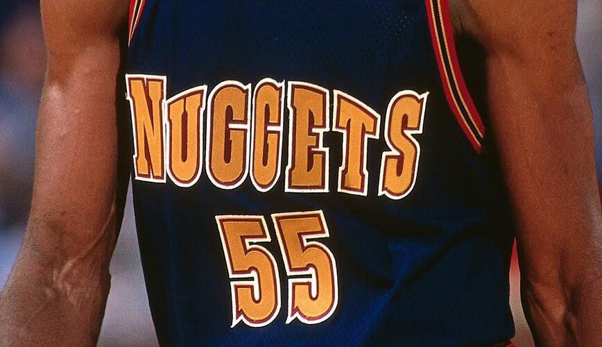

Gold. Mountains. Miner Symbols Captured Essence of Mile High Nuggets Basketball.

denver nuggets
NATIONAL BASKETBALL ASSOCIATION
TEAM REBRANDING
The Denver Nuggets name refers to the 19th century gold mining boom in Colorado. When the team reached out to NBA creative head, Tom O’Grady, for a complete rebrand, he recommended to team ownership to evolve from a multi-colored rainbow design to region relevant mile high navy blue, Colorado River red and metallic gold color scheme. The classic new identity was immediately popular with players and fans. In the late ‘90s, a complete color change was driven by new Nuggets GM and UCLA alum Kiki Vandeweghe, who worked with O’Grady on a snow powder blue, navy blue and bold yellow palette. A secondary logo O’Grady designed, which includes cross pick axes and a mountain top graphic over time has become the new primary logo for the Nuggets. A 23-year wait for a secondary logo to become a team’s primary identifier is unheard of in professional sports branding.
DELIVERABLES
Primary Logo - Secondary Logo - New Color Scheme - Uniforms - McNichols Arena Court Design - Warm-ups Design - Shooting Shirt Design


