

Crafting a Clean, Corporate, and Professional Look for New Jersey Nets Basketball.


new Jersey nets
NATIONAL BASKETBALL ASSOCIATION
TEAM REBRANDING
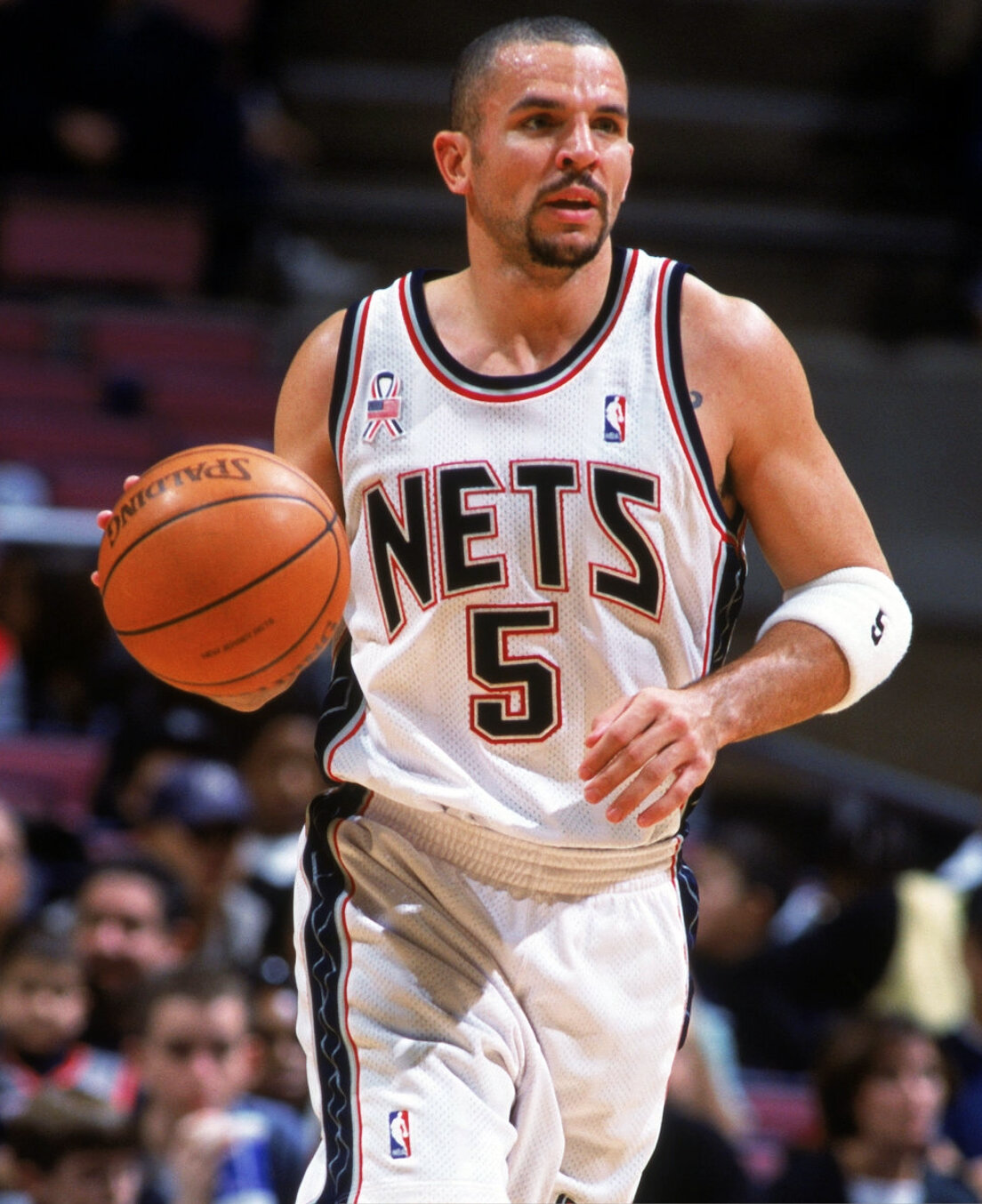
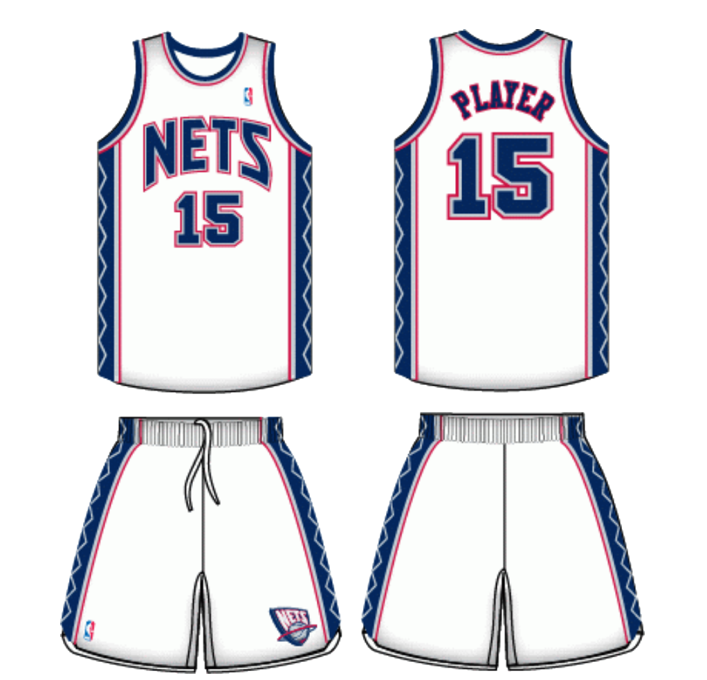
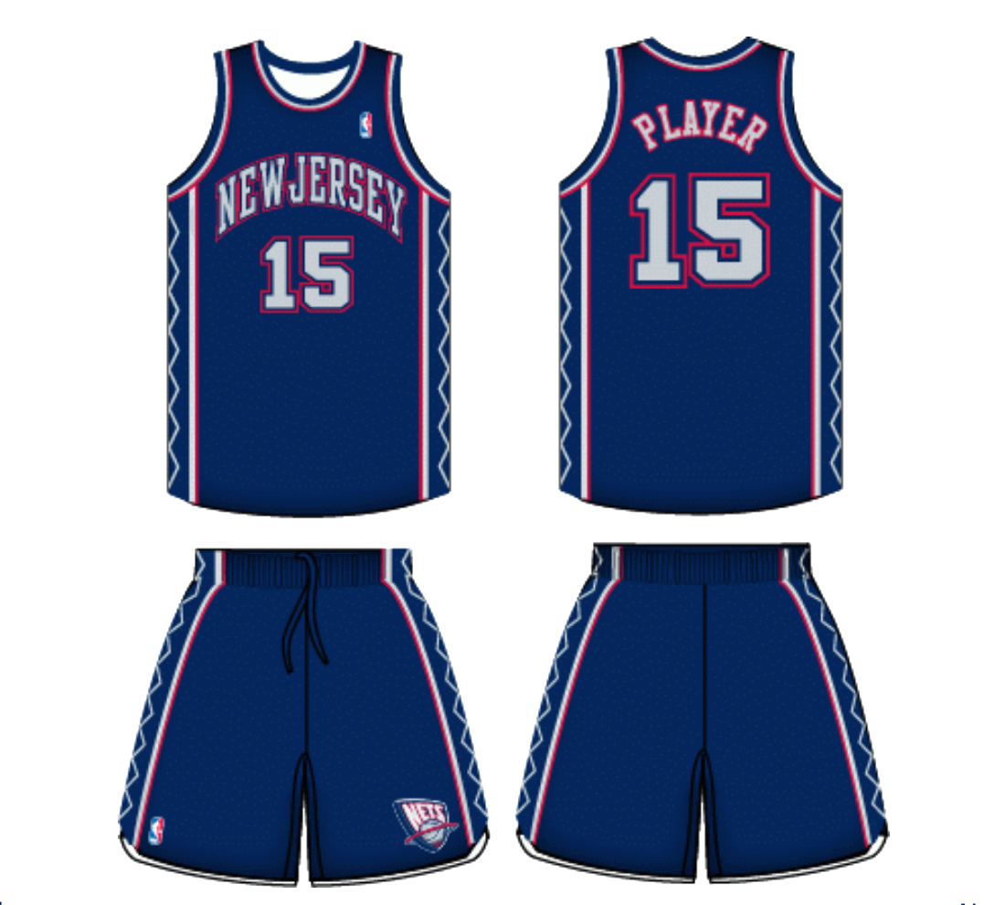
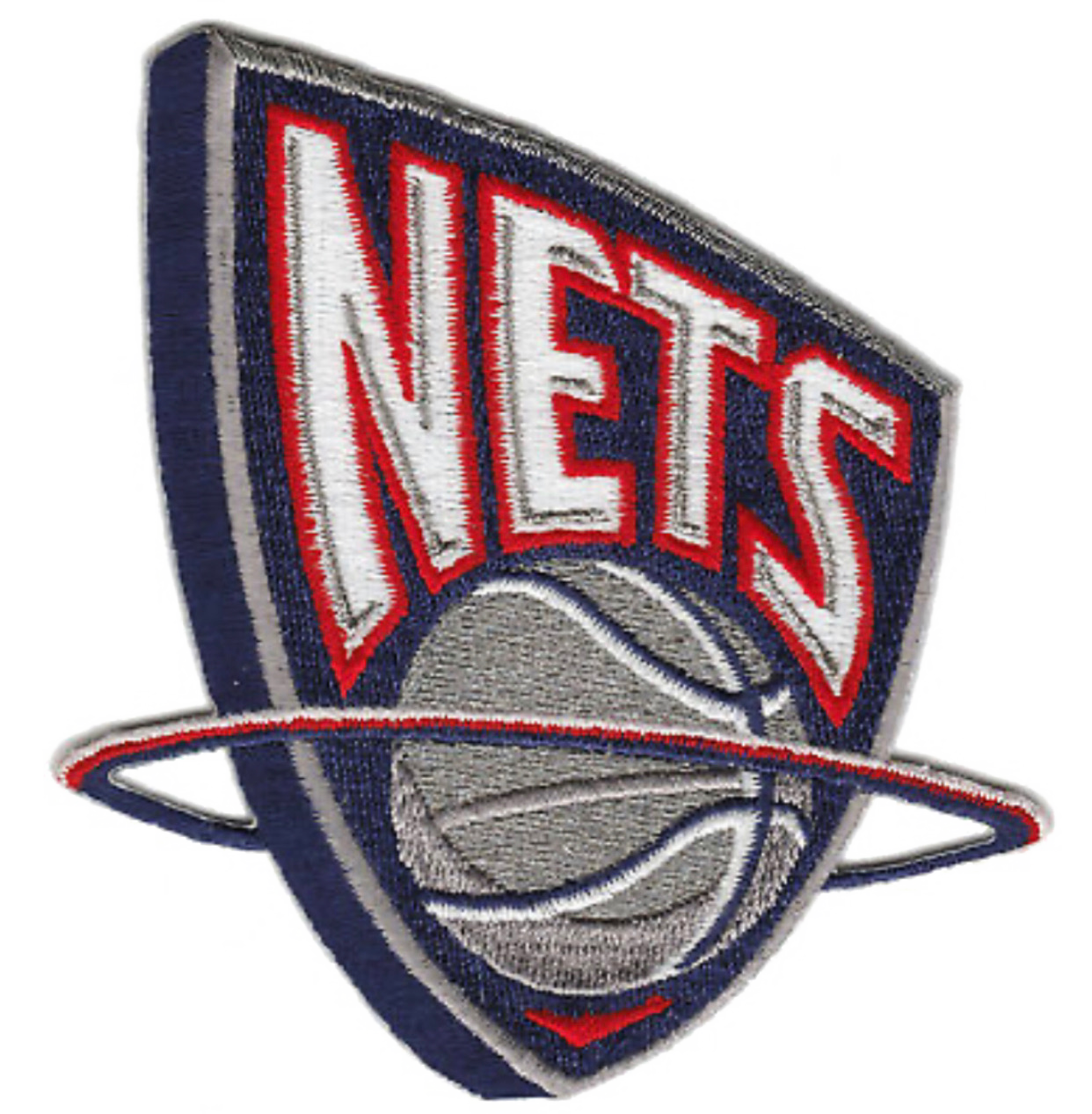
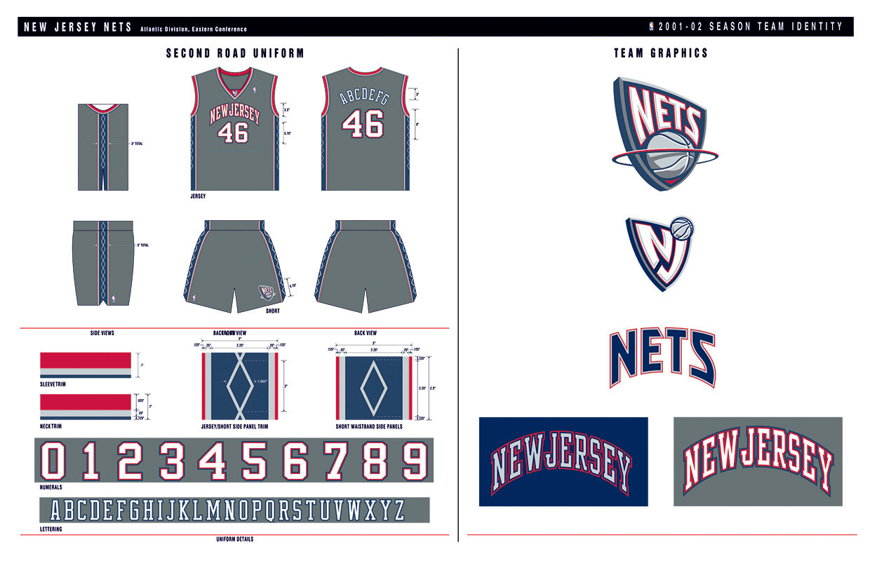
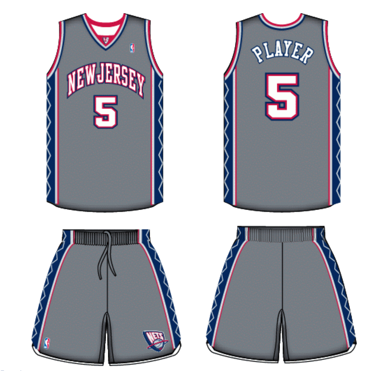
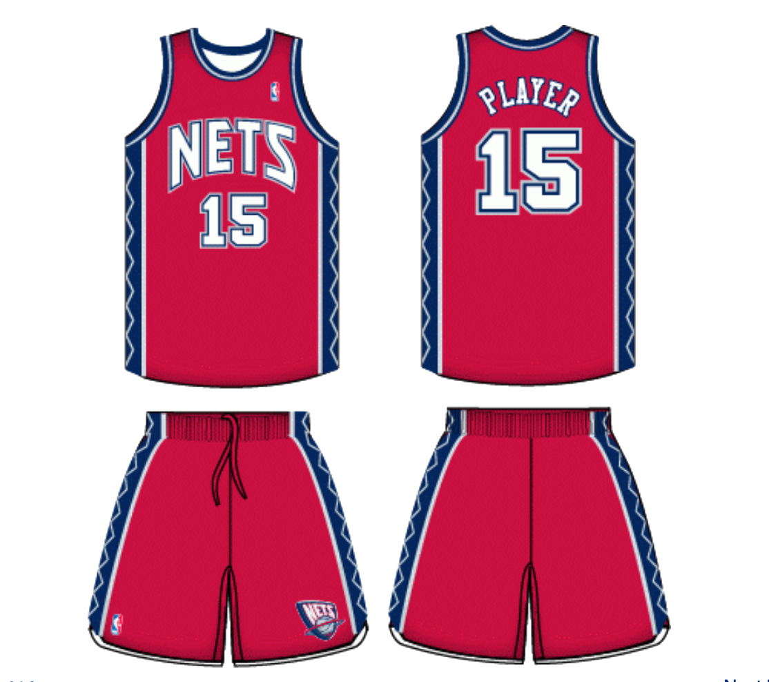
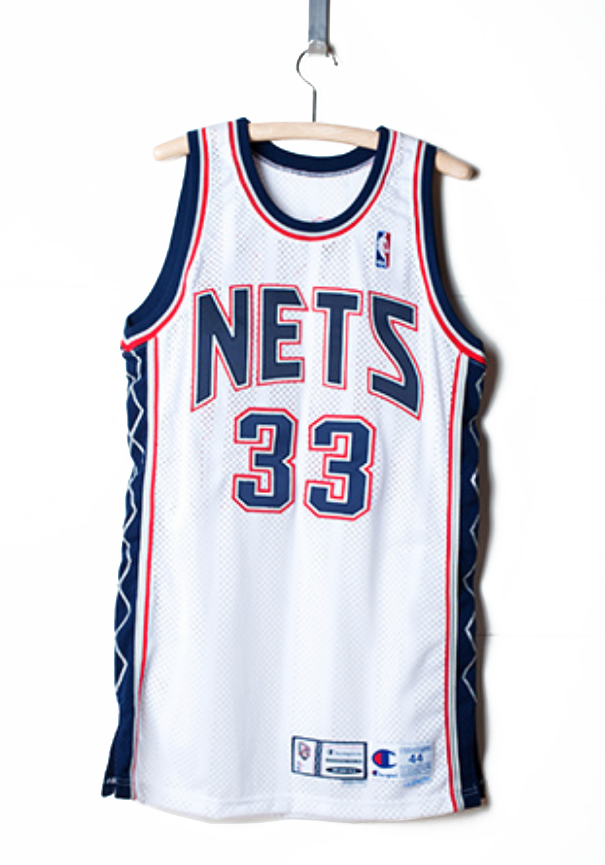
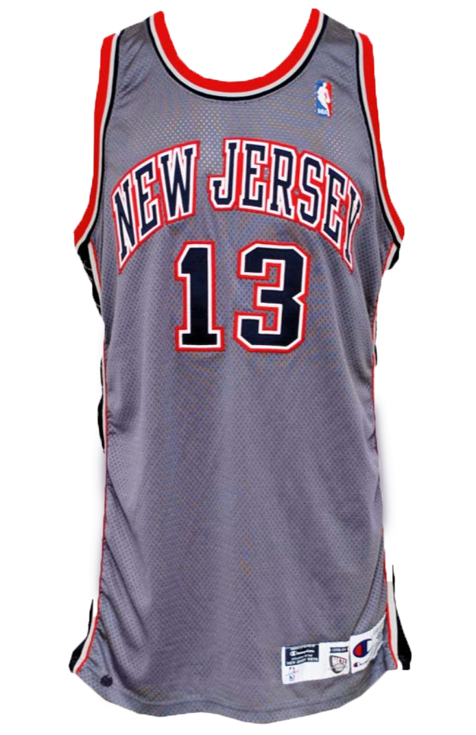
For many years the New Jersey Nets struggled finding an identity. In 1996, the team looked to the NBA to provide a streamlined, modern look. NBA creative head Tom O’Grady used a shield shape (similar to soccer crests) rendered in a 3-dimensional style to re-invigorate the Nets. O’Grady’s choice of navy blue, red, silver and metallic grey provided the team with a corporate rebrand which positively changed the perception of the franchise. A key element of the identity was a diamond trim pattern down the sides of the jersey and extended onto the court, digital assets and collateral content. The Nets added a popular battleship grey alternate uniform design the team wore during the 2002 NBA Finals. When the team moved to Brooklyn, the team adopted the shape of the NJ Nets logo, ball graphic and overall concept which they use currently.
DELIVERABLES
Primary Logo - Secondary Logos - New Color Scheme - Uniforms - Alternate Uniforms - Continental Airlines Arena Court Design - Warm-ups Design - Shooting Shirt Design - Mascot Design