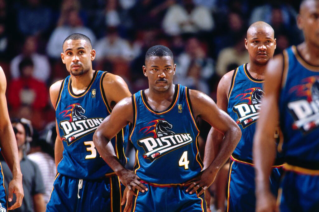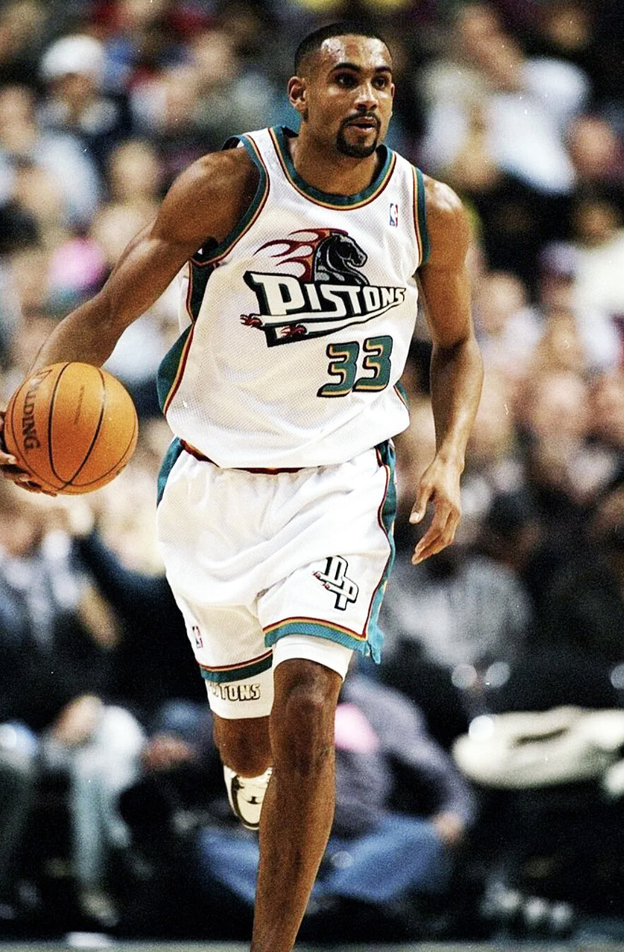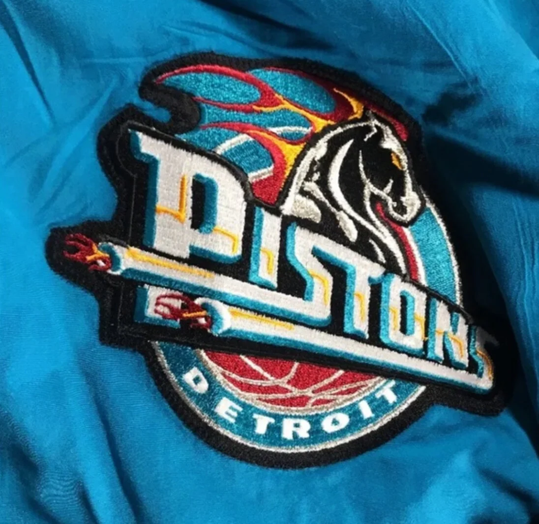

Teal Horsepower Symbolism Brought New Energy and Movement to Static Identity.

detroit pistons
NATIONAL BASKETBALL ASSOCIATION
TEAM REBRANDING
The Detroit Pistons wanted a big brand identity change and NBA Creative Director Tom O’Grady was the right creative visionary to deliver. O’Grady worked with Detroit President Tom Wilson to address updating the logo with a fresh look.
O’Grady used “horsepower” as the visual metaphor and featured a flaming horsehead, metallic Pistons font and tail pipes to re-ignite the Motor City brand. Tailpipes green, caution yellow, stoplight red and black was the new “in traffic” color palette which Detroit fans embraced enthusiastically purchasing Pistons products like never before.
Today, there is a steady drumbeat from DET fans to go back to the ignited Grant Hill Pistons brand.
DELIVERABLES
Primary Logo - Secondary Logo - New Color Scheme - Uniforms - Alternate Uniform - The Palace at Auburn Hills Court Design - Warm-ups Design - Shooting Shirt Design


