
Rebrand Provided a Super Sophisticated Team Identity to Emerald City of Seattle.
SEATTLE SUPERSONICS
NATIONAL BASKETBALL ASSOCIATION
TEAM REBRANDING
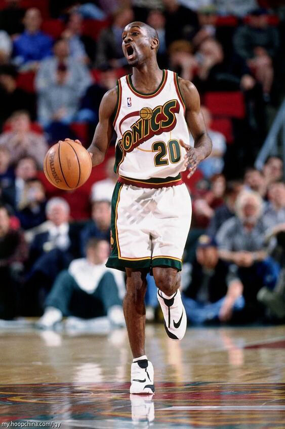
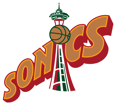
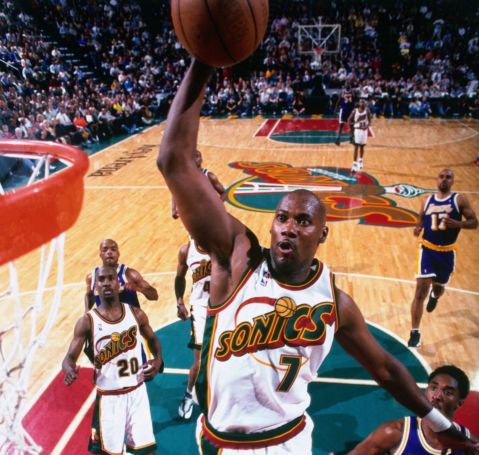
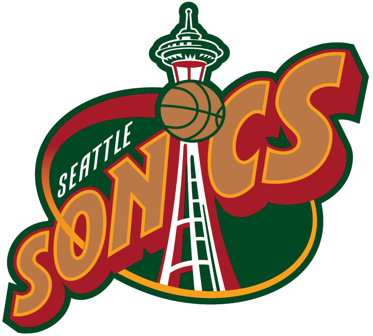
When Sonics owner Barry Ackerley made the decision to rebrand his Seattle team, he reached out to Commissioner Stern who suggested the Sonics work with league creative head Tom O’Grady to direct the new visual direction for the club. O’Grady spent time in Seattle researching the marketplace, a process he insists on even 25 years later to ensure indigenous relevancy is achieved as part of a rebrand. Tom was immediately struck by the Emerald’s City dark green, rust red and rich browns convincing him to move away from the previous HS looking kelly green and yellow. O’Grady found a way to suggest “SUPER” by developing a “super hero” comic book style typographic treatment with big and bold lettering moving towards the viewer suggesting movement and motion with the iconic Seattle space needle featured prominently in the primary logo.
DELIVERABLES
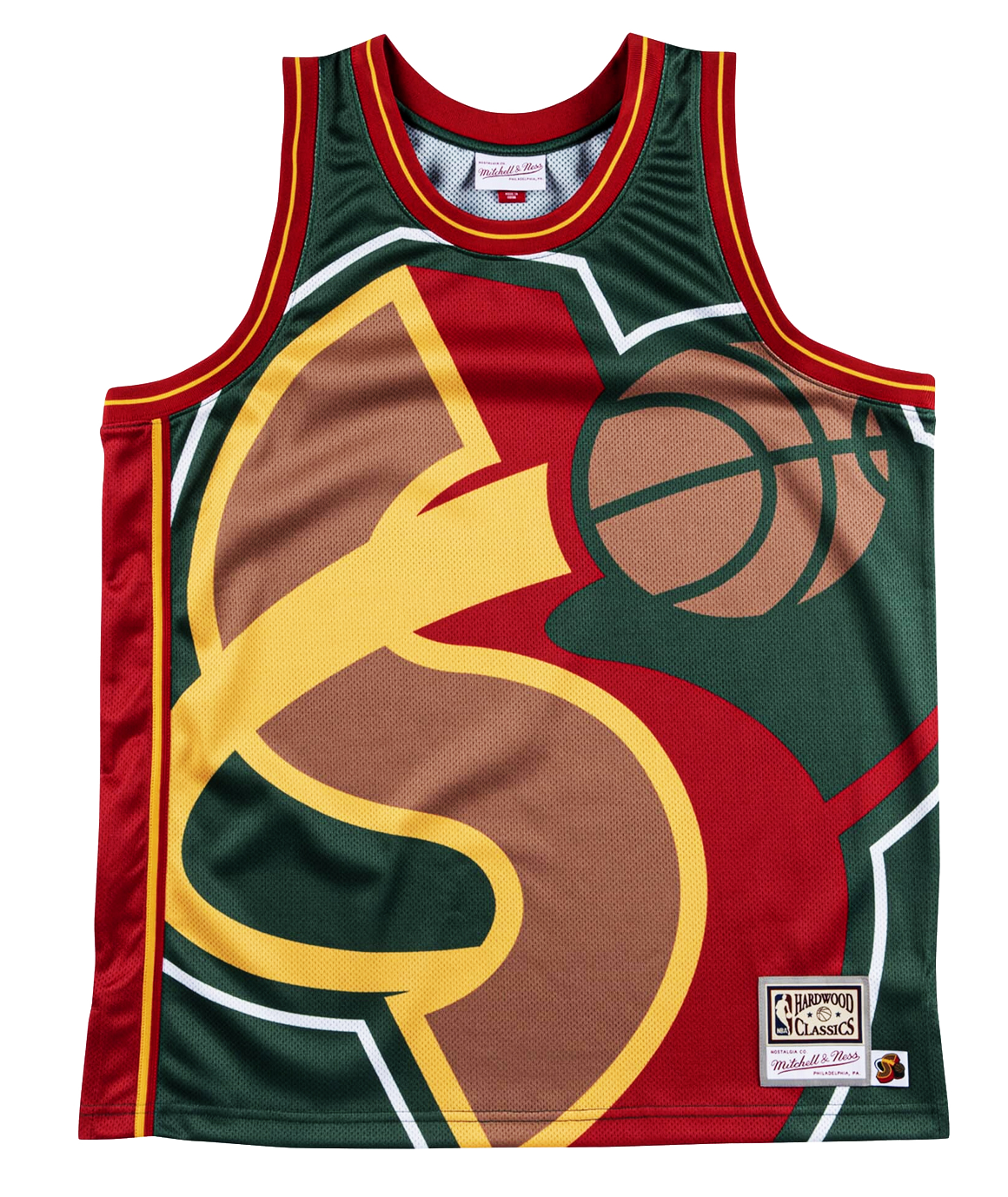
Primary Logo - Secondary Logos - New Color Scheme - Uniforms - Alternate Uniform - Key Arena Court Design - Warm-ups Design - Shooting Shirt Design