
Inspired by Wimbledon Colors, the Bucks Rebrand Modernized an Stale Campy Identity.


Milwaukee bucks
NATIONAL BASKETBALL ASSOCIATION
TEAM REBRANDING
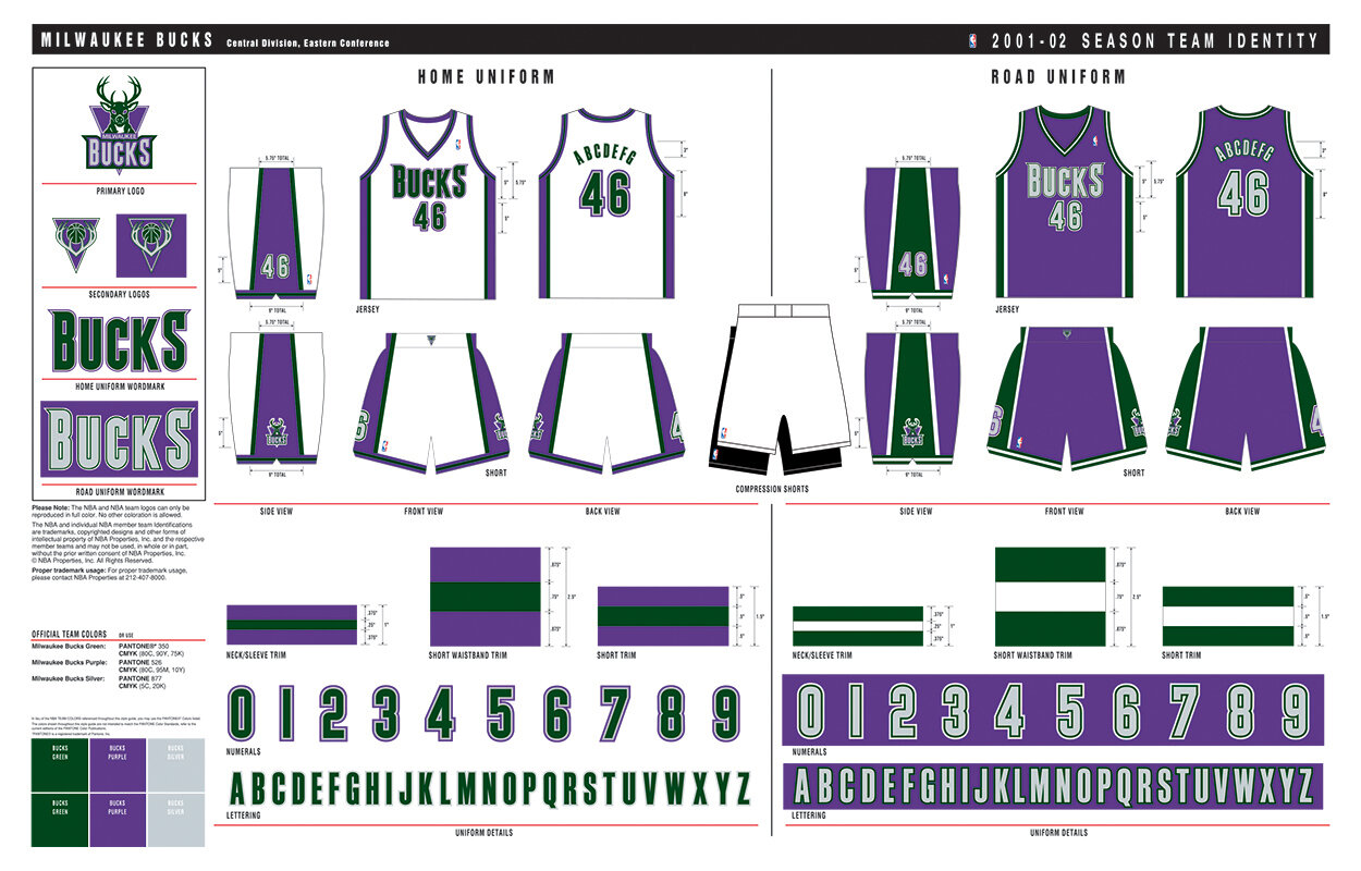
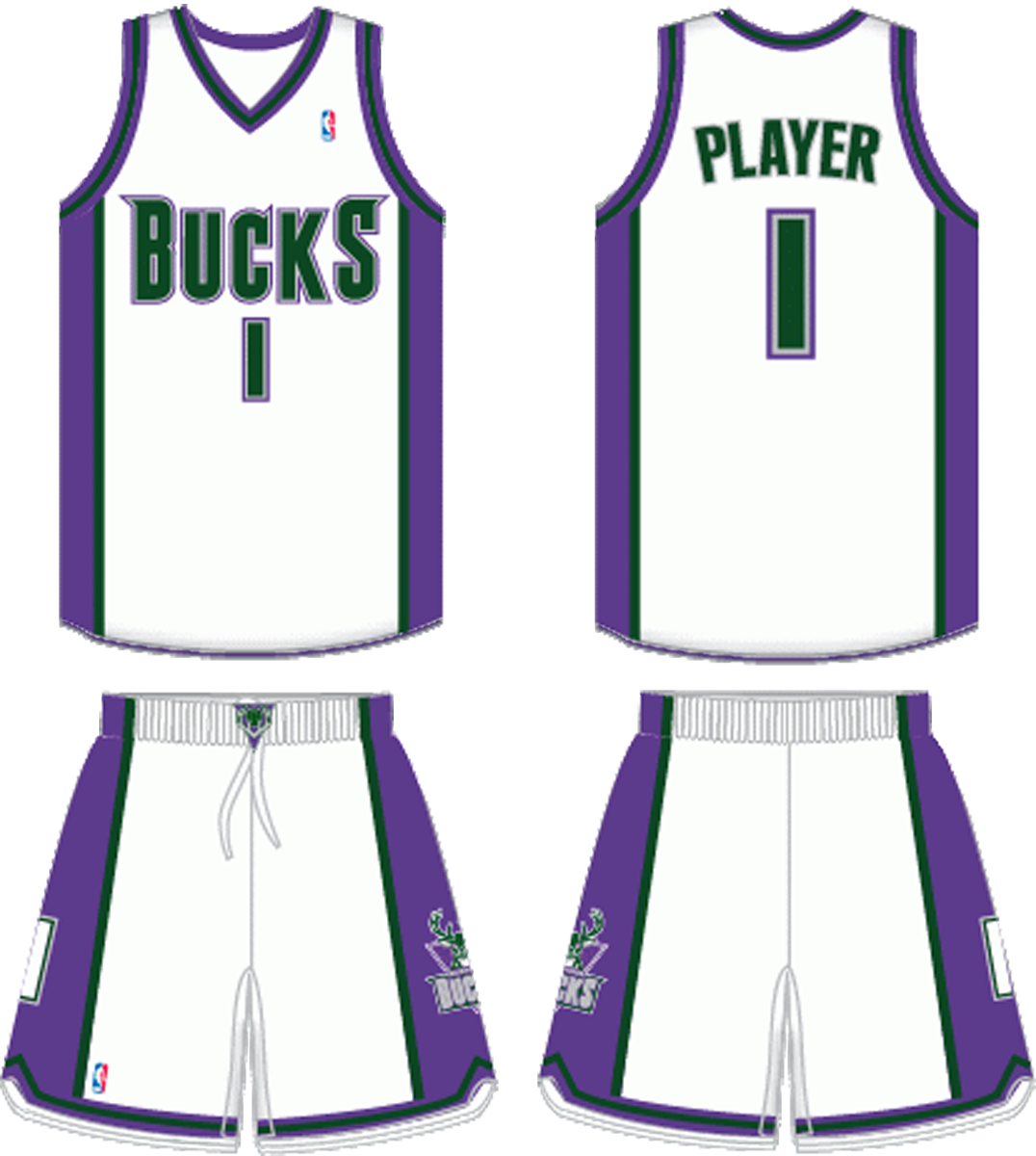
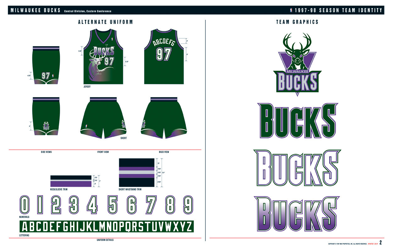
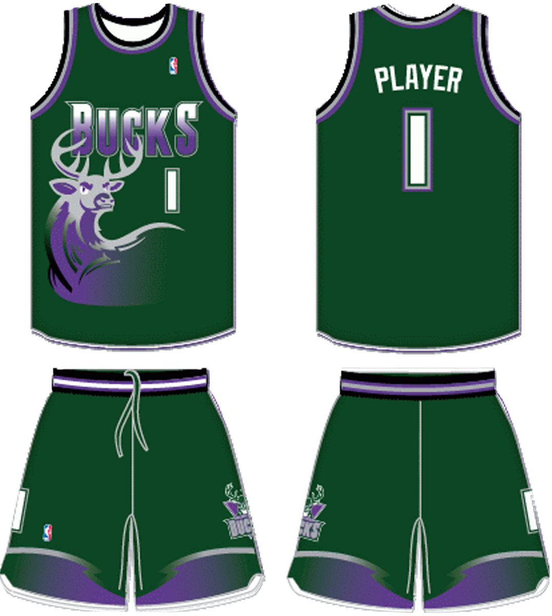
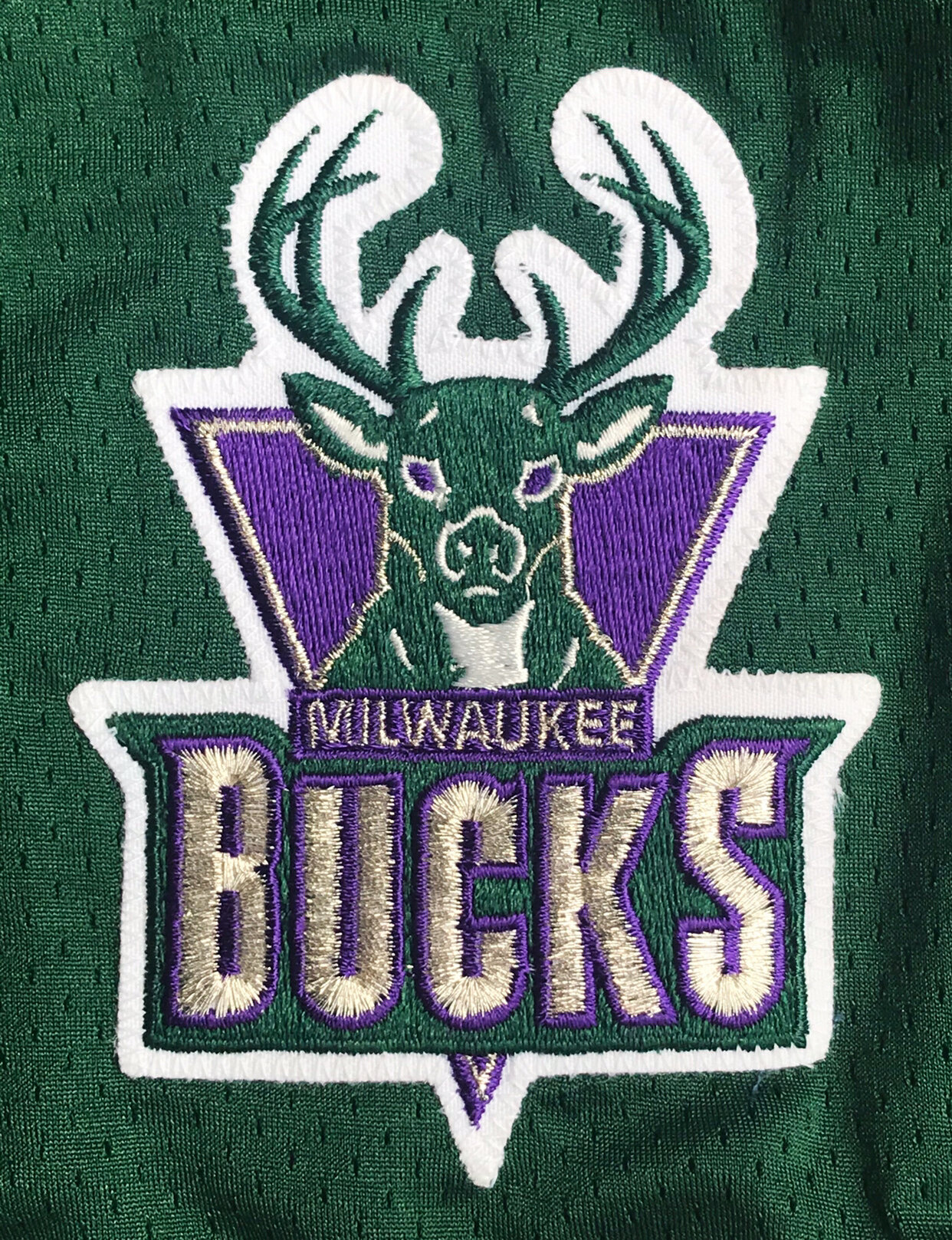
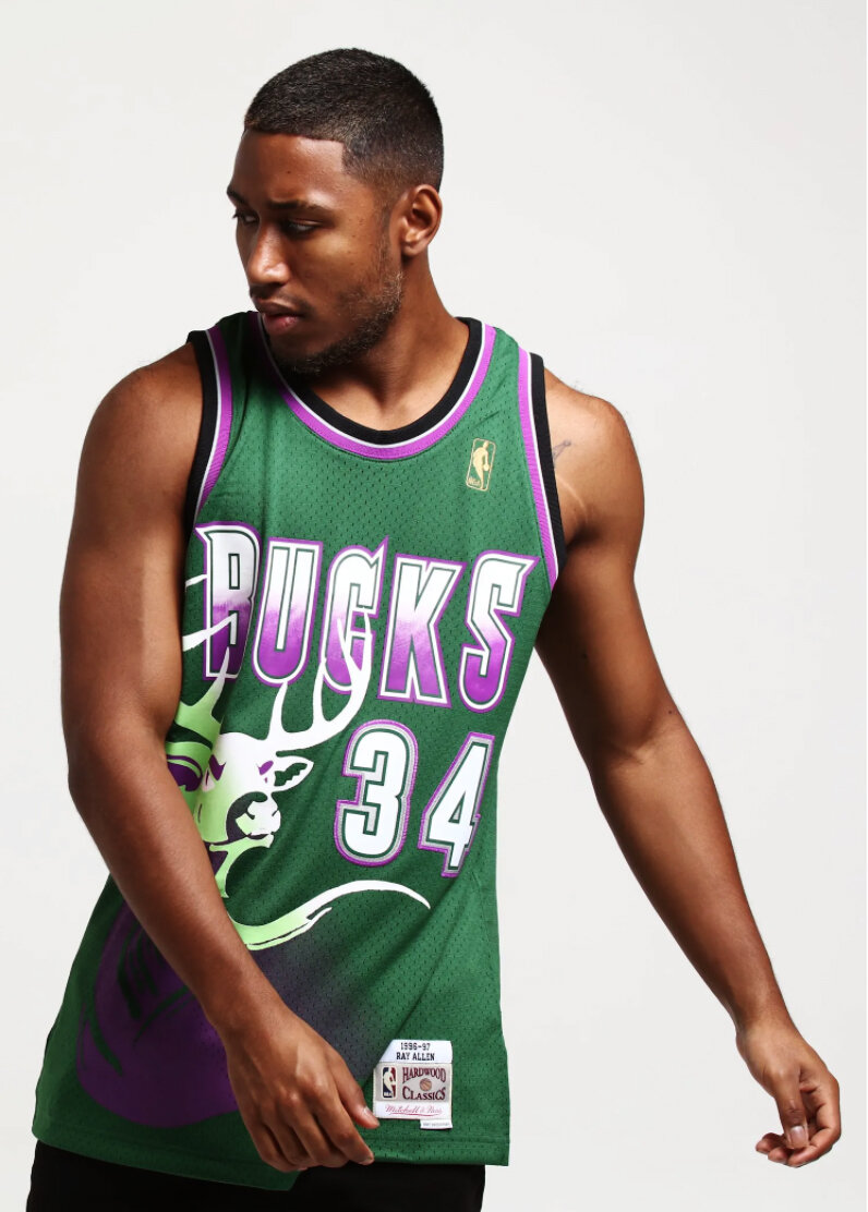
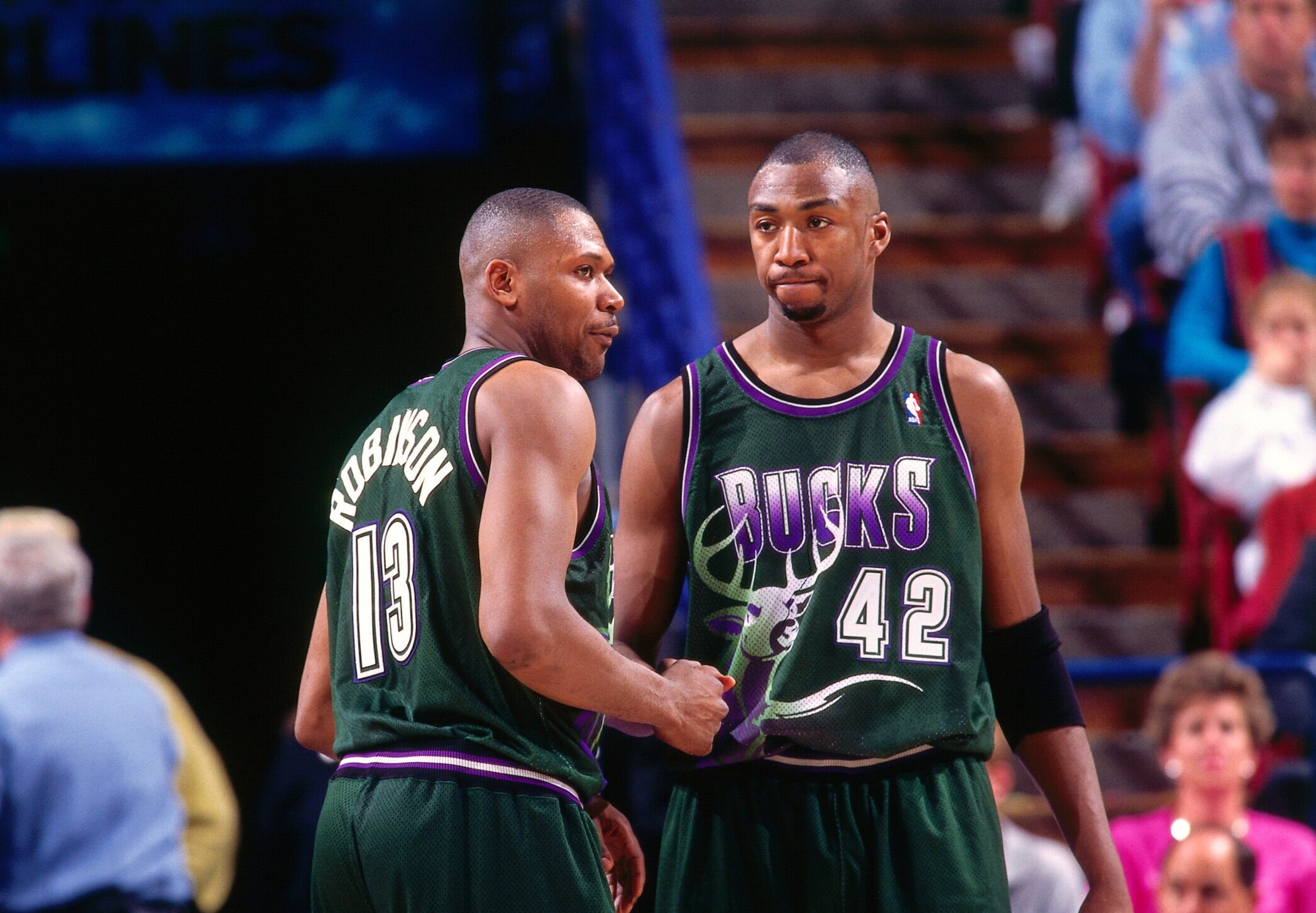
In the fall of 1991, O’Grady Sports Design founder Tom O’Grady received a mysterious Fed Ex package which included a dark green cap and purple polo shirt with the Wimbledon Championships logo on both. Also included was a hand-written note from the Head of Basketball Operations, Mike Dunleavy. This package and letter ignited the new Bucks identity with O’Grady using this color scheme as the basis for the rebrand. Tom commissioned national illustrator Dick Sakahara to develop a strong majestic forward-looking buck and then O’Grady built the identity around the graphic. In 1995, Tom worked with Sakahara to create one of the most popular alternate NBA team uniforms incorporating a powerful buck profile onto sublimated green, purple and black jersey and shorts.
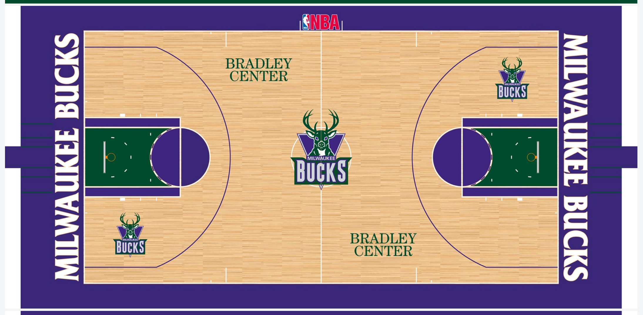
DELIVERABLES
Primary Logo - Secondary Logos - New Color Scheme - Uniforms - Alternate Uniform - Kohl Arena Court Design - Warm-ups Design - Shooting Shirt Design