Crown and Daggers with Purple, Black and Silver Merged Regal with a Tough Twist.

Sacramento kings
NATIONAL BASKETBALL ASSOCIATION
TEAM REBRANDING
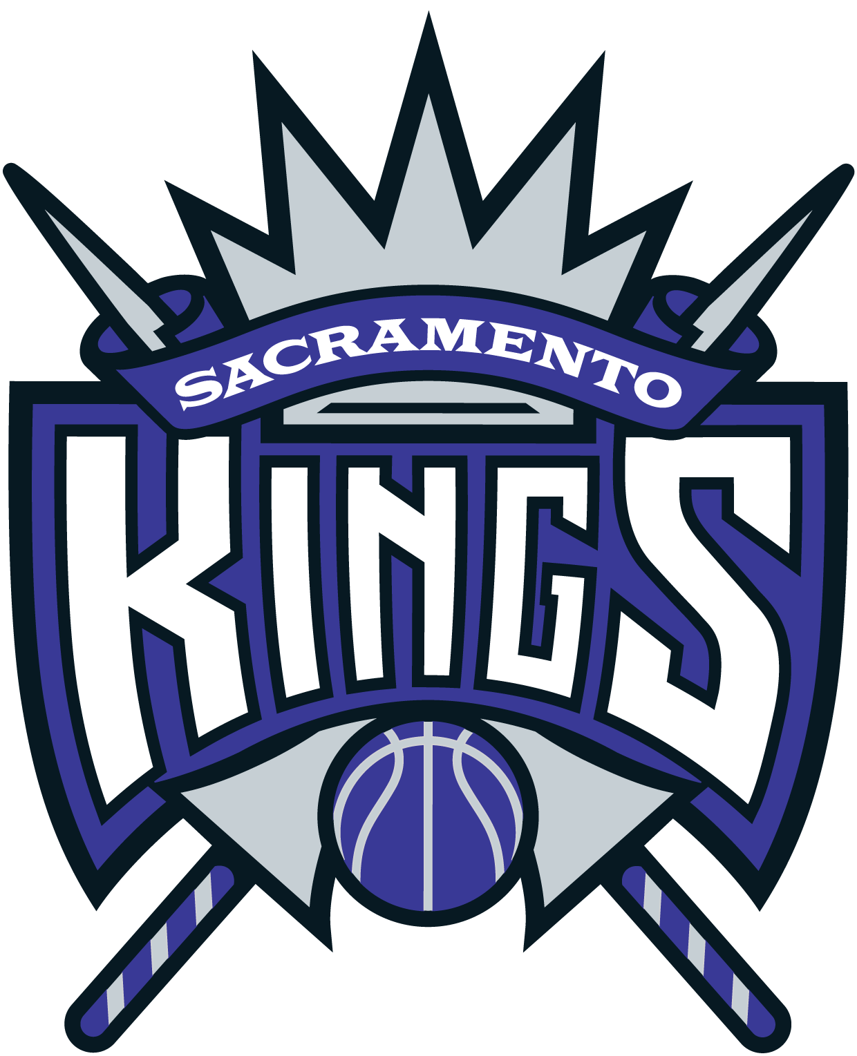
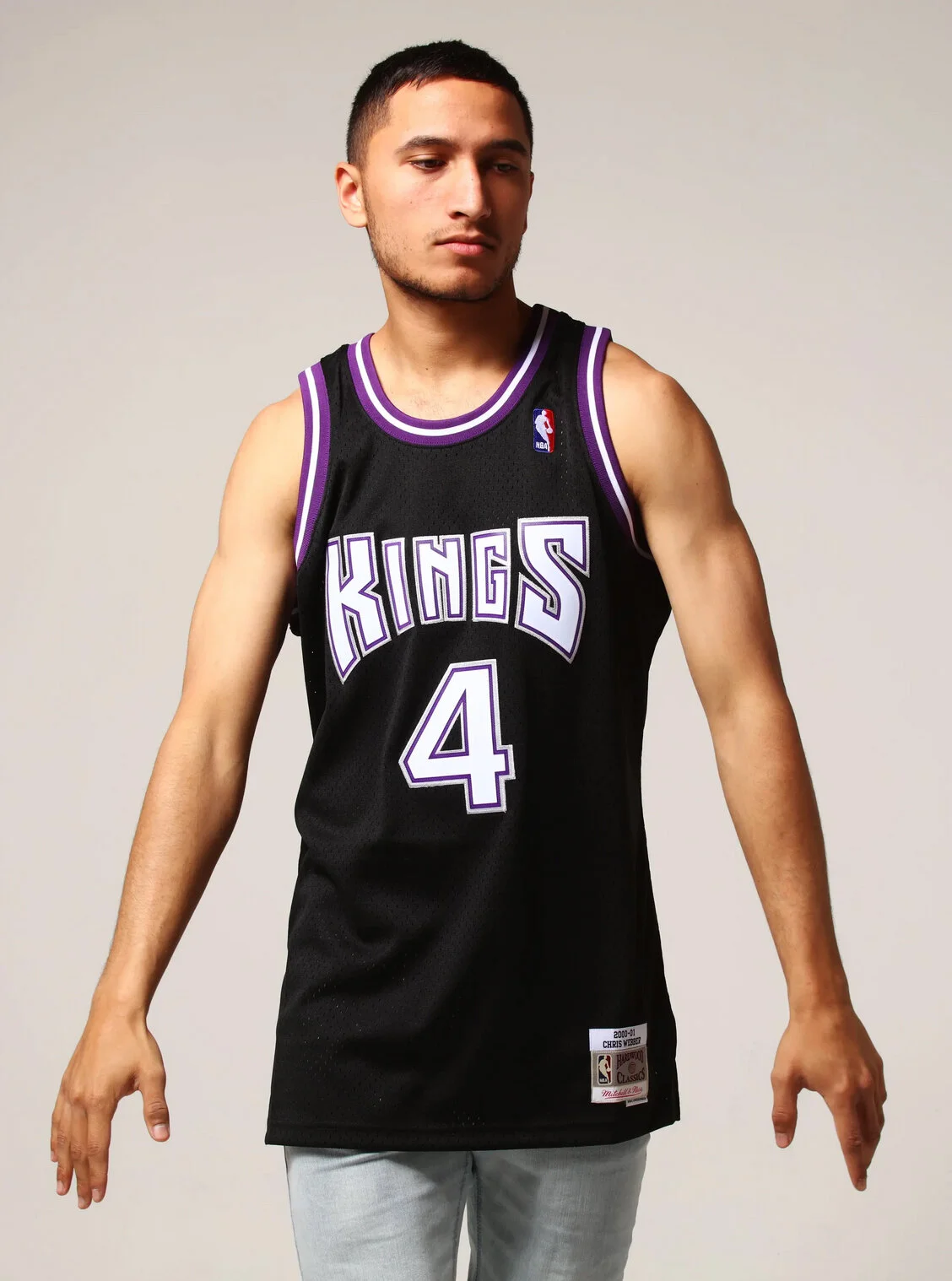
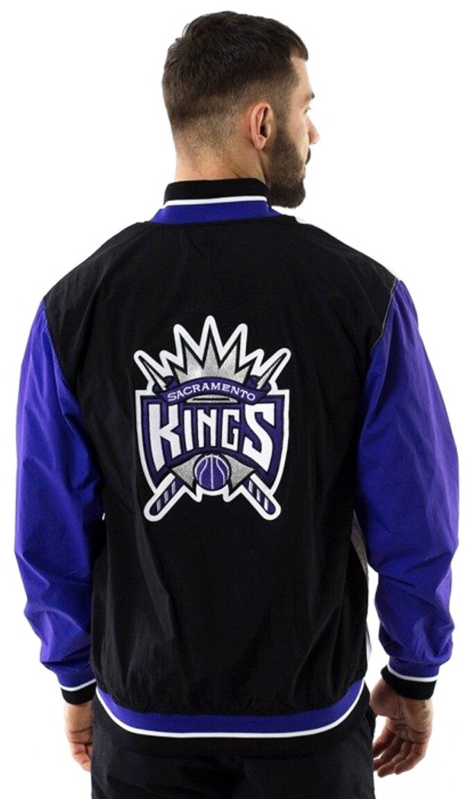
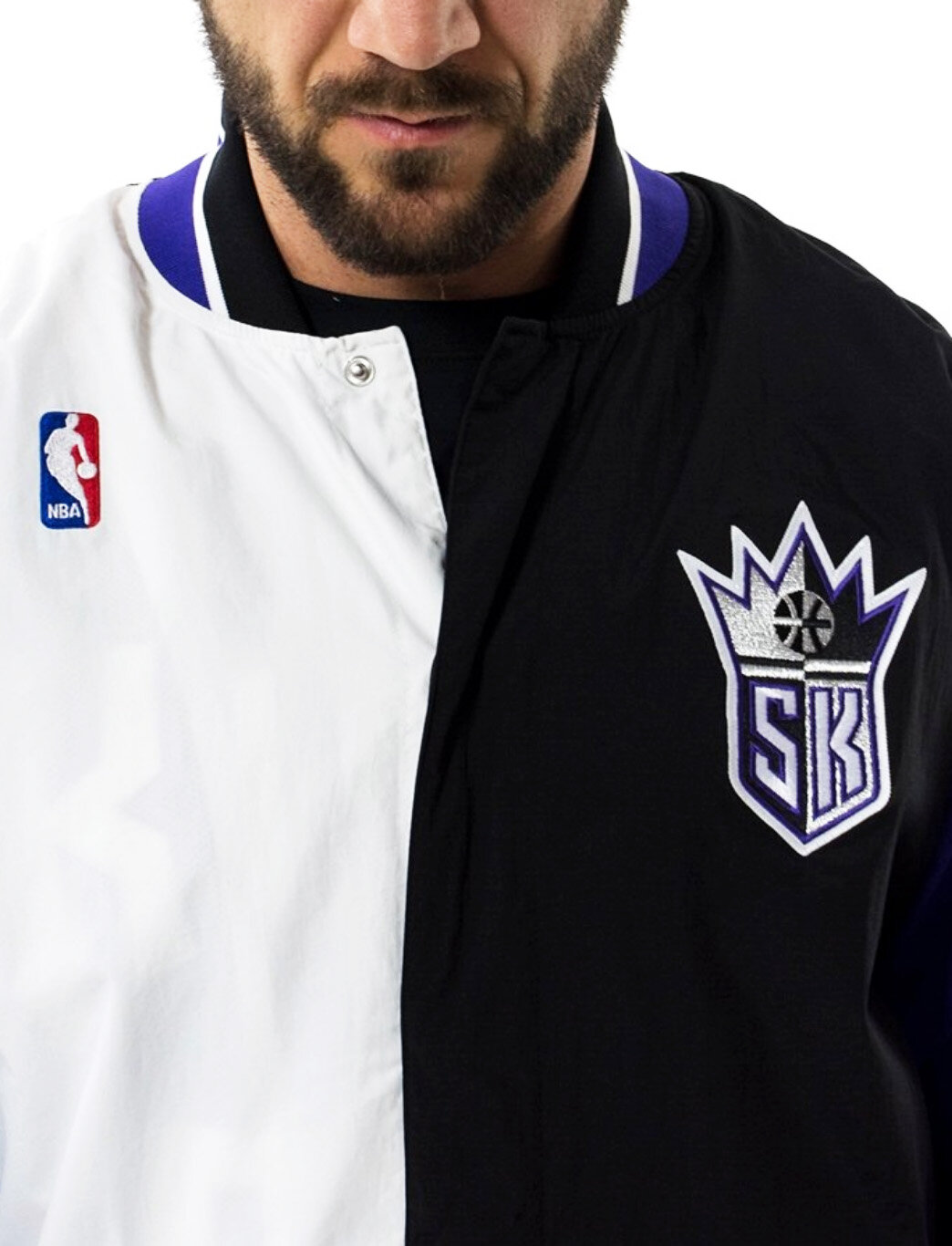
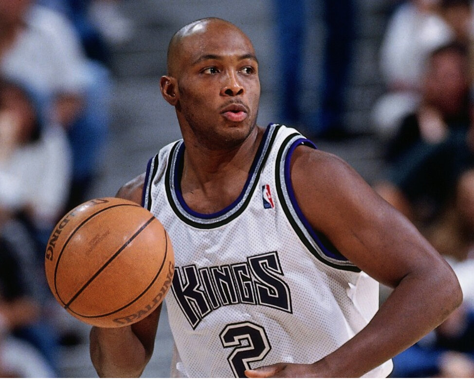
When Kings VP, Marketing John Thomas contacted NBA creative honcho Tom O’Grady, he had one important ask, please provide us with an identity which is regal but not medieval. The incumbent Sacramento red and blue ball and crown logo was not conveying any sense of royalty nor regalness. Tom O’Grady focused on ornate shields, crowns and armor style graphics featuring a color scheme of purple, black and silver. The new Kings primary logo addressed all objectives and then O’Grady introduced an SK secondary logo resembling a crusader shield which became as popular as the primary design.
DELIVERABLES
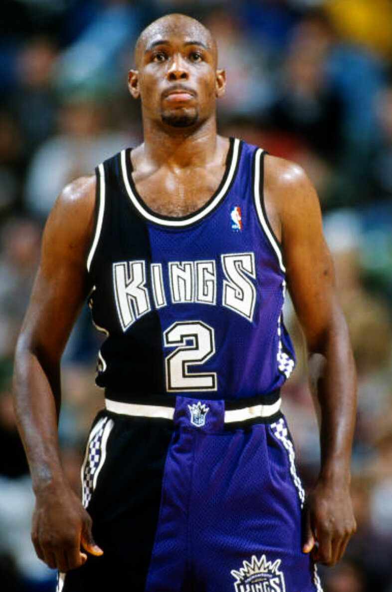
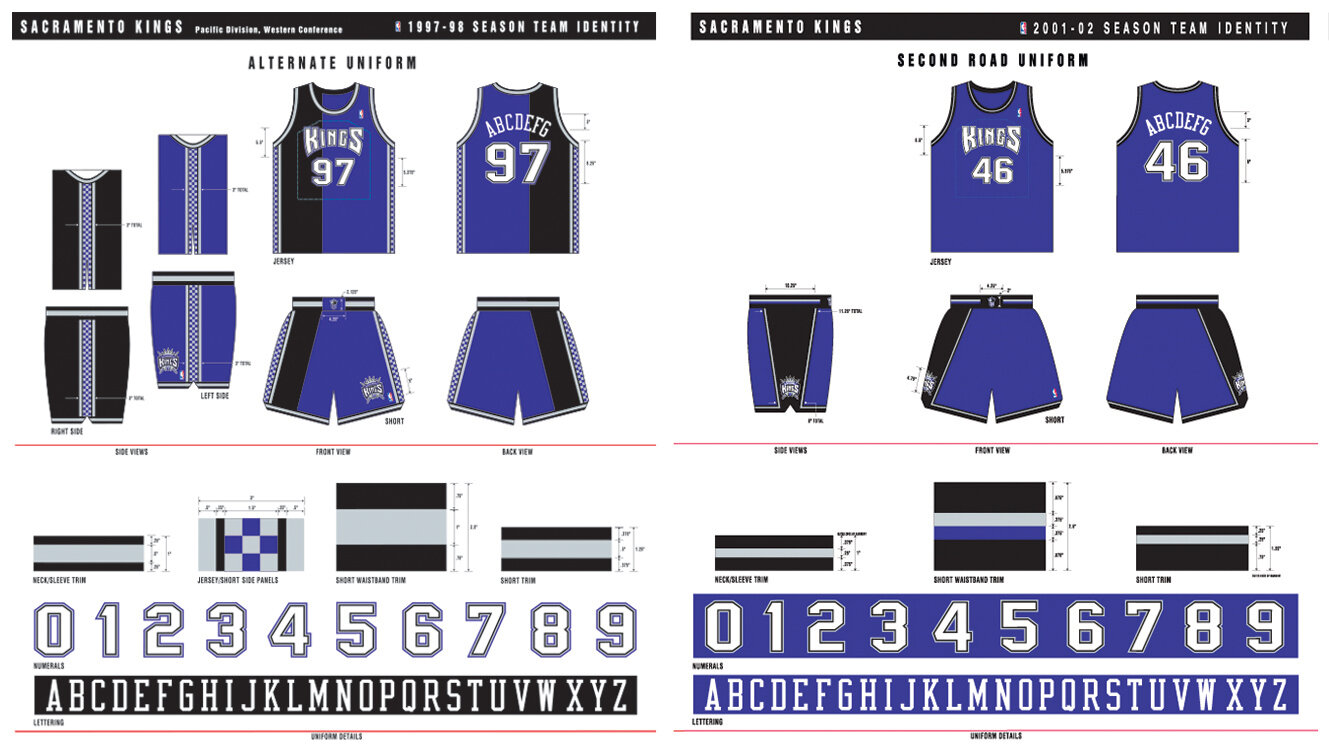
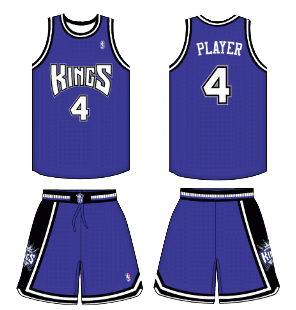
Primary Logo - Secondary Logos - New Color Scheme - Uniforms - Alternate Uniforms - First Union Center Court Design - Warm-ups Design - Shooting Shirt Design


